Exhibition Graphics
Exhibition Graphics: High-Impact Visual Solutions for Trade Shows and Events | UK
Introduction to Exhibition Graphics
Exhibition graphics are the visual cornerstone of any successful trade show or event presence. These high-impact displays, offered by companies like Reflex Exhibitions, transform ordinary exhibition spaces into eye-catching, brand-centric environments that capture attention and engage visitors. From shell scheme panels to large format prints, exhibition graphics encompass a wide range of visual solutions designed to showcase your brand, products, and messages in the most compelling way possible. In the competitive landscape of trade shows, conferences, and corporate events, well-designed exhibition graphics can make the difference between being overlooked and making a lasting impression on potential clients and partners.
Types of Exhibition Graphics
Shell Scheme Graphics
Shell scheme graphics are custom-printed panels designed to fit the modular framework provided by many exhibition venues. These graphics offer a cost-effective way to transform a basic shell scheme into a branded showcase. Available in materials such as PVC, fabric, and removable wallpaper, shell scheme graphics can be easily installed and removed, making them ideal for businesses that participate in multiple events. They provide a seamless, professional look that maximizes the visual impact of your exhibition space, effectively turning bland walls into powerful marketing tools.
Large Format Prints
Large format prints are the showstoppers of the exhibition world. These high-resolution graphics can cover entire walls, creating immersive branded environments that are impossible to ignore. Printed on a variety of materials including vinyl, fabric, and rigid boards, large format graphics offer unparalleled flexibility in design and application. They're perfect for creating dramatic backdrops, overhead banners, and freestanding displays that dominate the exhibition hall. With advancements in printing technology, these graphics can now achieve photographic quality at massive scales, allowing for incredibly detailed and visually stunning presentations.
Fabric Graphics
Fabric graphics have gained popularity in recent years due to their versatility, lightweight nature, and elegant appearance. These graphics are printed on specially treated fabrics that can be stretched over frames to create smooth, seamless displays. The key advantages of fabric graphics include their portability, ease of installation, and ability to be folded or rolled without damage. They're particularly effective for creating large, continuous graphics that can curve around corners or form three-dimensional structures. Fabric graphics also offer excellent color vibrancy and are ideal for photography-heavy designs, making them a go-to choice for fashion, travel, and lifestyle brands.
Choosing the Right Exhibition Graphics
Considering Your Exhibition Space
Selecting the appropriate exhibition graphics begins with a thorough understanding of your allocated space. Measure your area carefully, considering not just the dimensions but also any structural elements or restrictions. For shell schemes, ensure you have the exact panel sizes and configuration. For custom stands, work with your designer to create a floor plan that maximizes visual impact while allowing for practical considerations like traffic flow and product displays. Remember that different types of graphics may be more suitable for certain spaces – for instance, fabric graphics work well for curved or unconventional structures.
Material Selection
The choice of material for your exhibition graphics can significantly impact their effectiveness and longevity. PVC graphics offer durability and are easy to clean, making them ideal for frequent use. Fabric graphics provide a premium look and are lightweight, simplifying transport and installation. Removable wallpaper options, such as Phototex, offer easy application and removal without residue, perfect for temporary installations or venues with strict policies. Consider factors like reusability, transportation requirements, and the environmental impact of your materials. Many exhibitors are now opting for eco-friendly solutions to align with sustainability goals and appeal to environmentally conscious audiences.
Design Considerations
The design of your exhibition graphics is crucial in capturing attention and conveying your brand message effectively. Ensure your graphics align with your overall brand identity while standing out in a crowded exhibition hall. Use bold, high-contrast designs that are visible from a distance, and incorporate clear, concise messaging that communicates your key value propositions. Consider the viewing angles and distances in your exhibition space – text and important elements should be legible from various points. Incorporate high-quality images and infographics to break up text and convey information quickly. Remember, you have only seconds to make an impression on passing visitors, so your design must be both striking and informative.
The Exhibition Graphics Production Process
Design and Artwork Preparation
The journey from concept to finished exhibition graphics begins with meticulous design and artwork preparation. Work closely with your graphic designer to create visuals that not only look stunning but also effectively communicate your brand message. Pay attention to the technical requirements of large-format printing – ensure your files are set up at the correct size, resolution (typically 300 dpi for up-close viewing), and color mode (usually CMYK for print). Many suppliers provide templates for common exhibition structures, which can be invaluable in ensuring your design fits perfectly. Always double-check measurements and allow for bleed areas to avoid any white edges in the final print.
Printing and Quality Control
High-quality exhibition graphics rely on state-of-the-art printing technology and rigorous quality control processes. Modern large-format printers can produce incredibly detailed, vibrant prints on a wide range of materials. During the printing process, color management is crucial to ensure your brand colors are reproduced accurately. Many professional print shops will provide color proofs for your approval before full production. Quality control checks should be performed at multiple stages, examining for color accuracy, print quality, and any defects. For fabric graphics, additional steps like heat setting may be required to ensure color fastness and durability.
Finishing and Packaging
The finishing touches can make a significant difference in the final appearance and durability of your exhibition graphics. Depending on the material and intended use, graphics may be laminated to protect against scratches, UV damage, and moisture. Edges may be hemmed or fitted with silicone edging for fabric graphics. For rigid displays, mounting and framing options are considered at this stage. Proper packaging is essential to ensure your graphics arrive at the exhibition venue in perfect condition. Roll tubes for flexible materials and protective cases for rigid panels are common packaging solutions. Clear labeling and handling instructions can help prevent damage during transport and setup.
Installation and Setup
The installation of exhibition graphics can vary from simple DIY tasks to complex procedures requiring professional assistance. For shell scheme graphics, installation often involves attaching panels using Velcro or magnetic strips – a process that most exhibitors can handle themselves with some guidance. Fabric graphics typically use silicone edging that slots into aluminum frames, creating a smooth, tensioned surface. Large format prints may require more complex installation, especially for suspended or curved structures. Many exhibition service providers offer professional installation as part of their package, ensuring your graphics are perfectly aligned and securely fixed. If opting for self-installation, make sure you have all necessary tools and accessories, such as step ladders, spirit levels, and appropriate fixing materials. Always allow ample time for setup to avoid last-minute rushes or compromises in quality.
Maintaining and Storing Exhibition Graphics
Proper care and storage of your exhibition graphics can significantly extend their lifespan, ensuring they remain impactful across multiple events. For fabric graphics, gentle cleaning with a damp cloth is usually sufficient to remove dust and light marks. PVC and rigid materials can typically withstand more thorough cleaning with mild detergents. Always refer to the manufacturer's care instructions to avoid damage. When the exhibition is over, careful dismantling and storage are crucial. Roll flexible materials loosely to prevent creasing, and store in protective tubes or bags. Rigid panels should be stored flat or in specially designed cases to prevent warping or damage. Keep all graphics in a cool, dry place away from direct sunlight to prevent fading. With proper care, high-quality exhibition graphics can remain in excellent condition for many years, providing a cost-effective solution for businesses that exhibit frequently.
Custom Exhibition Graphic Solutions
Bespoke Design Services
While many businesses have in-house design capabilities, partnering with professional exhibition designers can elevate your graphics to new heights. These specialists understand the unique challenges and opportunities presented by exhibition environments. They can create cohesive visual narratives that guide visitors through your space, strategically highlighting key products or messages. Bespoke design services often include 3D visualization of your entire exhibition stand, allowing you to see how graphics will look in context before committing to production. This approach ensures all elements work harmoniously, from large backdrop graphics to smaller informational displays, creating a compelling and memorable brand experience.
Integrated Technology Options
Modern exhibition graphics often incorporate technology to create interactive and dynamic displays. Digital screens can be seamlessly integrated into graphic panels, allowing for video content, live demonstrations, or real-time social media feeds. Augmented reality (AR) elements can bring static graphics to life, offering visitors an engaging and immersive experience. LED lighting can be used to highlight specific areas of your graphics or create dramatic effects. When planning your exhibition graphics, consider how technology can enhance your message and create memorable interactions with your audience. The key is to use technology purposefully, ensuring it complements rather than overwhelms your core brand message.
Sustainability in Exhibition Graphics
As environmental concerns become increasingly important to businesses and consumers alike, the exhibition industry is responding with more sustainable graphic solutions. Eco-friendly materials such as recycled fabrics, biodegradable vinyls, and FSC-certified boards are now widely available. Many printing companies use water-based or UV-cured inks that have lower environmental impact. Reusable graphics systems, such as modular frames with interchangeable fabric graphics, can significantly reduce waste over time. When designing your exhibition strategy, consider how graphics can be repurposed for multiple events or recycled at the end of their life. Some companies are even exploring innovative solutions like graphics printed on seed paper that can be planted after use. By prioritizing sustainability in your exhibition graphics, you not only reduce your environmental footprint but also demonstrate your company's commitment to responsible business practices – a message that resonates strongly with many consumers and partners.
Case Studies: Successful Exhibition Graphics
Case Study 1: A tech startup used a combination of large format backdrops and interactive digital displays at a major industry conference. The seamless integration of striking visuals and touch-screen technology allowed visitors to explore product features in an engaging way, resulting in a 250% increase in qualified leads compared to their previous text-heavy stand.
Case Study 2: A cosmetics brand leveraged fabric graphics to create an immersive, Instagram-worthy environment for a product launch event. The soft, curved structures and high-quality photographic prints provided the perfect backdrop for social media sharing, generating significant online buzz and extending the event's reach far beyond the physical attendees.
Case Study 3: An engineering firm transformed their traditional shell scheme space using a combination of printed panels and 3D elements. By incorporating actual product components into the graphic design, they created a visually striking and informative display that effectively showcased their technical expertise, leading to several high-value contract discussions initiated at the show.
Frequently Asked Questions (FAQ)
- How long does it take to produce custom exhibition graphics?
Production time can vary depending on the complexity and size of the project, but typically allow 7-10 working days for standard orders. Rush services may be available for urgent requests.
Copy - Can I reuse my exhibition graphics for multiple events?
Yes, most exhibition graphics are designed for multiple uses. Fabric and rigid graphics are particularly durable and can be used many times with proper care and storage. - What's the difference between PVC and fabric exhibition graphics?
PVC graphics are more rigid and durable, ideal for frequent use. Fabric graphics are lightweight, easy to transport, and provide a high-end, seamless look. Both have their advantages depending on your specific needs. - How do I ensure my exhibition graphics are high quality?
Work with reputable suppliers who use modern printing technology and offer proofing services. Provide high-resolution artwork and clearly communicate your quality expectations. - Are your exhibition graphics fire-resistant?
Many materials used for exhibition graphics are treated to meet fire safety standards. Always check with your supplier and ensure compliance with venue regulations. - Can you print graphics for curved or irregular-shaped stands?
Yes, modern printing and production techniques allow for graphics to be created for virtually any shape or structure. Fabric graphics are particularly versatile for curved surfaces. - What's the largest size graphic you can produce?
With current large format printing technology, graphics can be produced in sections and joined seamlessly to cover very large areas. Some printers can produce single pieces up to 5 meters wide. - How do I clean and maintain my exhibition graphics?
Cleaning methods depend on the material. Generally, a soft, damp cloth is sufficient for most surfaces. Always refer to the care instructions provided by your supplier. - Can you match specific brand colours in the printing process?
Yes, professional printers use color management systems to match brand colors accurately. Providing Pantone color codes or physical color swatches can help ensure accuracy. - Do you offer rush services for last-minute orders?
Many suppliers offer expedited services for urgent orders, though this may incur additional costs. It's always best to plan ahead when possible to ensure the best quality and value.
Conclusion
Exhibition graphics play a crucial role in creating impactful, memorable displays that can significantly enhance your brand's presence at trade shows and events. From versatile shell scheme solutions to stunning large format prints and innovative fabric displays, the right graphics can transform your exhibition space into a powerful marketing tool. By carefully considering your space, choosing appropriate materials, and investing in professional design and production, you can create graphics that not only attract attention but also effectively communicate your brand message and values. As the exhibition industry continues to evolve, embracing new technologies and sustainable practices in your graphic solutions can further set your brand apart. Whether you're a seasoned exhibitor or preparing for your first trade show, partnering with experienced professionals in exhibition graphics can help you maximize the return on your event investment and create lasting impressions on your target audience.

Case Studies on Successful Colour Application in Exhibition Graphics
Case Study 6 delves into the realm of creating a memorable experience with interactive colour elements. The featured exhibition successfully employed a diverse colour palette to engage visitors and leave a lasting impact. By strategically incorporati...
Read more →
Enhancing Visual Appeal through Colour Application in Exhibition Graphics
In the realm of modern exhibitions, the application of colour plays a crucial role in captivating the attention of attendees and conveying the intended message effectively. A key trend that has emerged in recent years is the use of bold and vibrant c...
Read more →
Best Practices for Colour Application in Exhibition Graphics
Colour selection in exhibition graphics plays a crucial role in ensuring accessibility for all visitors. It is essential to consider factors such as colour contrast, brightness, and saturation to cater to individuals with visual impairments. High con...
Read more →
Incorporating Colour Theory into Exhibition Graphics
Understanding the colour wheel is fundamental in graphic design as it serves as a guiding tool for creating visually appealing and harmonious designs. The colour wheel consists of primary colours (red, blue, yellow), secondary colours (green, orange,...
Read more →
Choosing the Right Colour Palette for Exhibition Graphics
When designing exhibition graphics, one key aspect to consider is experimenting with different shades and tints. The interplay between lighter and darker variations of a particular colour can have a significant impact on the overall aesthetic of your...
Read more →
Impact of Colour Contrast in Exhibition Graphics
Colour contrast plays a significant role in contemporary exhibition design, with designers increasingly exploring bold and dynamic combinations to captivate audiences. Vibrant contrasts between colours not only help in attracting attention but also c...
Read more →
Utilising Colour Psychology in Exhibition Graphics
Understanding cultural considerations in colour usage is paramount when designing exhibition graphics that resonate with diverse audiences. Different cultures associate varying meanings and emotions with specific colours, and being aware of these ass...
Read more →
Understanding Colour Schemes for Exhibition Graphics
When designing exhibition graphics, enhancing visibility and readability is crucial for effectively capturing the attention of your audience. Selecting the right colour scheme plays a significant role in achieving this goal. By choosing high-contrast...
Read more →
Tips for Effective Colour Application in Exhibition Graphics
Avoiding colour overload is a crucial aspect to consider when designing exhibition graphics. Using too many colours can overwhelm viewers and dilute the impact of your message. One effective strategy is to stick to a limited colour palette that compl...
Read more →
Optimising Colour Contrast for Maximum Impact in Exhibition Graphics
When it comes to designing exhibition graphics, understanding colour theory is essential to creating visual impact and effectively conveying your message. Colour theory is the foundation of every design element, influencing the mood, perception, and ...
Read more →
Importance of Colour Application in Exhibition Graphics
Staying on top of the latest colour trends is crucial for exhibition graphics to remain appealing and relevant to the target audience. Colours play a significant role in how a brand is perceived and can influence the overall success of an exhibition ...
Read more →
Enhancing Visual Hierarchy through Colour Contrast in Exhibition Graphics
Achieving a harmonious design through balanced colour contrast is essential in creating visually appealing exhibition graphics. When selecting colours for your design, it is important to consider not only the hues themselves but also their relationsh...
Read more →
Effective Application of Colour Contrast in Exhibition Graphics
Creating a cohesive visual identity for an exhibition is crucial in capturing the essence of a brand and effectively communicating its message. When harmonising colour contrast with branding, it is essential to stay true to the brand's established co...
Read more →
Creating Visual Impact with Colour Contrast in Exhibition Graphics
Colour contrast plays a pivotal role in setting the tone and atmosphere of exhibition graphics. By strategically combining contrasting hues, designers can evoke a wide range of emotions and responses from viewers. Bold contrasts between warm and cool...
Read more →
Mastering the Use of Contrast in Colour Theory for Exhibition Graphics
Textures play a crucial role in amplifying the contrast between colours in exhibition graphics. By incorporating tactile elements, such as embossed patterns or matte finishes, designers can create a visually dynamic experience for viewers. These text...
Read more →
Exploring the Principles of Colour Contrast in Exhibition Graphics
Colour accessibility in exhibition graphics is a crucial aspect that designers need to consider when creating visual materials for display. Ensuring readability for all audiences is essential to facilitate effective communication and engagement. When...
Read more →
The Impact of Colour Contrast on Visual Communication in Exhibition Graphics
Calls to action play a crucial role in guiding the audience towards desired actions, whether it's making a purchase, signing up for a newsletter, or attending an event. The strategic use of colour contrast can significantly enhance the effectiveness ...
Read more →
Utilizing Colour Contrast to Enhance Exhibition Graphics
Colour psychology plays a crucial role in influencing how audiences perceive and interact with exhibition graphics. By strategically incorporating specific colours, designers can evoke different emotions and reactions from viewers. For example, warm ...
Read more →
Understanding the Role of Contrast in Colour Theory for Exhibition Graphics
Contrast plays a pivotal role in guiding viewer attention when it comes to exhibition graphics. By strategically combining colours with varying degrees of contrast, designers can lead the viewer's eye towards specific focal points within the design. ...
Read more →
The Importance of Colour Contrast in Exhibition Graphics
When examining successful colour contrast strategies in exhibition graphics, it becomes evident that the use of complementary colours can greatly enhance visual impact. One notable case study involves a tech company that implemented a bold contrast b...
Read more →
The Power of Colour Psychology in Capturing Attention in Exhibition Displays
When it comes to establishing a cohesive visual identity for exhibition displays, one of the key elements to consider is the use of a consistent colour scheme. By selecting a palette that aligns with your brand identity and messaging, you can create ...
Read more →
Leveraging Colour Psychology for Effective Exhibition Graphics
When it comes to creating exhibition graphics, ensuring visual harmony and avoiding colour clashes are crucial aspects to consider. The use of clashing colours can distract and overwhelm attendees, detracting from the overall impact of your exhibitio...
Read more →
Creating Memorable Exhibition Experiences with Colour Psychology
Creating a cohesive exhibition experience with colour harmony is essential in capturing the attention of visitors and leaving a lasting impression. When designing an exhibition space, it is crucial to carefully select a colour palette that not only c...
Read more →
Enhancing Audience Engagement through Colour Psychology in Exhibition Graphics
Colour perception is heavily influenced by cultural associations, with different colours holding varying meanings across different societies and regions. For example, while white symbolises purity and peace in Western cultures, it can represent mourn...
Read more →
Exploring the Role of Colour Psychology in Exhibition Design
Colour plays a crucial role in exhibitions by enhancing communication with the audience. When used strategically, colours can evoke specific emotions, set the tone, and convey intended messages effectively. In exhibition design, colours act as a sile...
Read more →
Applying Colour Psychology Principles in Exhibition Graphics
Colours play a crucial role in shaping audience perception within exhibition settings. The strategic use of colours can evoke specific emotions and moods, influencing how visitors interact with the displays. When selecting colours for exhibition grap...
Read more →
The Psychological Effects of Colour in Exhibition Displays
Cultural influences play a significant role in shaping colour preferences, both on an individual and societal level. Different cultures ascribe varying meanings and symbolism to colours, which can influence how colours are perceived and chosen for ex...
Read more →
Utilizing Colour Psychology to Enhance Exhibition Graphics
Choosing the right colours for exhibition graphics can significantly impact how the brand message is perceived by the audience. Colours have the power to evoke emotions, create associations, and communicate the brand's values without the need for wor...
Read more →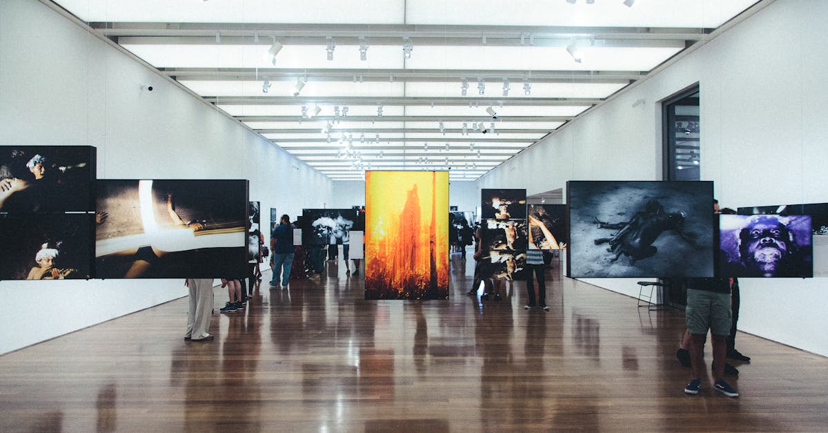
Understanding the Emotional Impact of Colour in Exhibition Design
Creating a cohesive and visually appealing colour scheme in exhibition design can significantly enhance the overall user experience. Colours have the power to evoke emotions, convey messages, and influence how visitors perceive and interact with the ...
Read more →
The Influence of Colour Psychology in Exhibition Graphics
When designing exhibition graphics, using contrasting colours can be a powerful tool to create visual interest and captivate the audience. By strategically combining colours that are opposite on the colour wheel, such as red and green or blue and ora...
Read more →
Mastering Colour Harmony for Compelling Exhibition Graphic Displays
Establishing visual hierarchy through colour contrast is a fundamental principle in creating compelling exhibition graphic displays. By strategically utilising contrasting colours, designers can guide viewers' eyes to specific focal points, creating ...
Read more →
Implementing Colour Harmony Strategies for Successful Exhibition Graphics
Colour plays a significant role in evoking emotions and creating connections with the audience in exhibition graphics. By strategically selecting hues that resonate with the intended feelings, designers can effectively communicate the desired message...
Read more →
Enhancing Communication through Colour Harmony in Exhibition Design
Contrast in exhibition design can greatly enhance visual impact and draw attention to key elements within the space. By strategically incorporating contrasting colours, designers can create a dynamic and engaging environment that captures the viewers...
Read more →
Achieving Balance and Unity through Colour Harmony in Exhibition Graphics
In exhibition graphics, guiding viewer attention is paramount to effectively communicate the intended message. Through strategic use of colour, designers can direct the viewer's gaze towards key elements and create a visual hierarchy that guides the ...
Read more →
Utilizing Colour Harmony for Effective Exhibition Graphic Design
Split-complementary colour combinations have become a popular choice for designers looking to add a modern touch to their exhibition graphics. This harmonious blend involves selecting a base colour and then complementing it with two colours adjacent ...
Read more →
Exploring Colour Harmony Techniques for Exhibition Graphics
Warm and cool tones play a pivotal role in exhibition design, contributing significantly to the overall ambiance and visual impact of the display. When balancing warm and cool hues in graphic elements, designers need to consider the emotions and resp...
Read more →
Applying Colour Harmony Principles to Exhibition Graphics
When it comes to creating visually appealing exhibition graphics, exploring the realm of tetradic colour combinations can offer a myriad of possibilities. By combining four hues in a harmonious way, designers can achieve a balanced and striking visua...
Read more →
Creating Visual Impact with Colour Harmony in Exhibition Graphics
Colour plays a crucial role in shaping the perception of the audience when viewing exhibition graphics. The careful selection and combination of colours can evoke specific emotions and responses in viewers, influencing how they engage with the displa...
Read more →
The Importance of Colour Harmony in Exhibition Design
Brand identity is a crucial aspect of any business, as it differentiates a company from its competitors and communicates its values to the audience. One effective way to enhance brand identity in exhibition design is through thoughtful colour selecti...
Read more →
Understanding Colour Harmony in Exhibition Graphics
Visual hierarchy is crucial in exhibition graphics as it helps guide the viewers' eyes through the design in a structured and intentional manner. Using colour strategically is a powerful tool to enhance this hierarchy by creating contrast between dif...
Read more →
Using Warm and Cool Colors on the Colour Wheel
When it comes to designing interiors, balancing warmth and coolness is essential to create a harmonious space. By incorporating both warm and cool colors strategically, you can evoke different moods and affect the overall ambiance of a room. Warm col...
Read more →
Creating Visual Impact with the Colour Wheel
Selecting the appropriate colour palette for your project is a crucial decision that can greatly impact the overall visual appeal and effectiveness of your design. Understanding the fundamentals of the colour wheel is essential in creating harmonious...
Read more →
Shades, Tints, and Hues: Manipulating the Colour Wheel
Analogous color schemes are a powerful tool in the hands of designers and artists. By selecting colors that sit next to each other on the color wheel, a sense of harmony and cohesion can be achieved in any composition. This creates a visually pleasin...
Read more →
Tetradic Color Harmony and the Colour Wheel
When it comes to incorporating tetradic harmony in interior design, it is crucial to understand the principles of this colour scheme. Tetradic colours are a combination of four hues that are equidistant on the colour wheel. This creates a sense of ba...
Read more →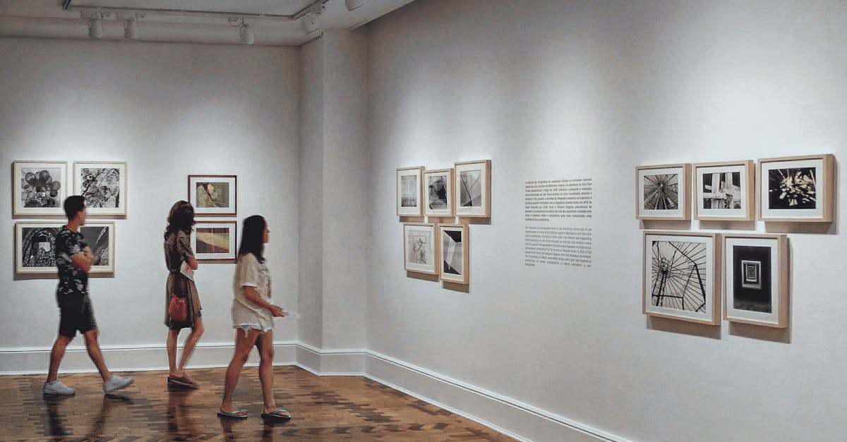
Split-Complementary Color Schemes and the Colour Wheel
When implementing split-complementary color schemes, it is crucial to choose a dominant color from the color wheel. This dominant color will serve as the primary hue in the scheme, anchoring the overall aesthetic. Selecting a dominant color that reso...
Read more →
Triadic Color Schemes and the Colour Wheel
Triadic color schemes offer a harmonious blend of three colors that are evenly spaced around the color wheel. An effective example of a triadic color scheme can be seen in the flag of France, which features blue, white, and red. These colors form a b...
Read more →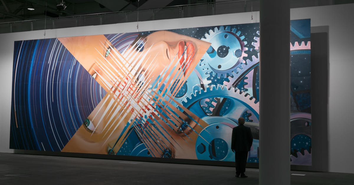
Complementary Colors: Opposites on the Colour Wheel
When it comes to working with complementary colors, there are common mistakes that many individuals tend to make. One of the most frequent errors is using too many intense shades together without considering their balance. This can result in a chaoti...
Read more →
Primary, Secondary, and Tertiary Colors on the Colour Wheel
Warm colors, consisting of reds, oranges, and yellows, evoke feelings of heat, energy, and vibrancy. These hues are often associated with the sun, fire, and warmth, creating a sense of coziness and excitement when used in design and art. Red, the bol...
Read more →
Exploring Analogous Colors on the Colour Wheel
Analogous colors play a significant role in the world of design and art. They are colors that sit next to each other on the color wheel and share similar undertones, resulting in a harmonious and visually appealing palette. Understanding the importan...
Read more →
Effective Use of Typography in Digital Exhibition Design
Consistency in typography is a fundamental aspect of creating a cohesive visual identity in digital exhibition design. By maintaining a consistent use of typefaces, font sizes, spacing, and styles across all digital exhibits, designers can establish ...
Read more →
Understanding the Basics of the Colour Wheel
Monochromatic schemes offer a simple yet effective approach to creating a harmonious colour palette. This technique involves sticking to variations of a single colour for a cohesive and visually pleasing look. By playing with different shades, tints,...
Read more →
Typography Accessibility in Digital Exhibitions
Colour contrast plays a pivotal role in enhancing the legibility of text in digital exhibitions. It is imperative to ensure that the background colour and the text colour have enough contrast to guarantee readability for all users. Low contrast can l...
Read more →
Optimizing Typography for Various Digital Platforms in Exhibitions
Responsive typography plays a crucial role in ensuring that exhibition content is displayed optimally across various digital platforms. By employing responsive design principles, typography can adapt seamlessly to different screen sizes, resolutions,...
Read more →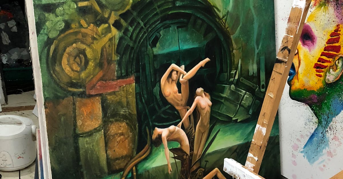
Interactive Typography for Digital Exhibitions
When designing digital exhibitions, it is crucial to consider typography accessibility guidelines to ensure that text content is legible and comprehensible for a diverse audience. Inclusive font design plays a significant role in making the text acce...
Read more →
Typography Trends in Digital Exhibitions
Typography plays a crucial role in shaping the user experience of digital exhibitions. When considering accessibility in digital exhibition typography, it is essential to focus on using readable fonts that cater to a diverse range of users. By select...
Read more →
Incorporating Brand Identity Through Typography in Digital Exhibitions
Typography plays a crucial role in conveying brand identity and storytelling in digital exhibitions. The fonts chosen, along with their size, spacing, and style, contribute to the overall aesthetic and messaging of the brand. By selecting appropriate...
Read more →
Responsive Typography for Digital Exhibitions
Typography plays a crucial role in enhancing user experience within digital exhibitions. Integrating typography effectively with user interface design can greatly impact how content is perceived and interacted with by visitors. The choice of fonts, s...
Read more →
Enhancing User Experience with Typography in Digital Exhibitions
In the realm of digital exhibitions, implementing responsive typography design plays a crucial role in crafting a seamless and visually appealing user experience. The adaptability of typography across various devices and screen sizes is paramount in ...
Read more →
Best Practices for Typography in Digital Exhibitions
Text contrast plays a crucial role in enhancing the overall readability and visual appeal of digital exhibitions. By utilizing varying font sizes, weights, and styles, designers can create a dynamic visual hierarchy that guides the viewer's attention...
Read more →
Importance of Typography in Digital Exhibitions
Typography plays a crucial role in enhancing website legibility and engaging users effectively. By carefully selecting fonts that are easy to read and well-spaced, digital exhibitions can create a seamless browsing experience for visitors. The choice...
Read more →
Font Pairing Strategies for Engaging Exhibition Displays
When designing exhibition displays, font combinations play a crucial role in creating an engaging visual experience for visitors. Experimenting with different fonts can help convey the tone and message of the exhibition effectively. By combining seri...
Read more →
Achieving Cohesive Design with Thoughtful Font Pairing
Decorative fonts can bring a unique and eye-catching element to your design, adding personality and flair to your typography. When incorporating decorative fonts, it is essential to strike a balance between creativity and legibility. These fonts are ...
Read more →
The Psychology of Font Pairing in Exhibition Graphics
Colour psychology plays a pivotal role in the art of font pairing for exhibitions, influencing how viewers perceive and engage with the displayed content. Each colour carries its own emotional connotations and associations, which can evoke varying re...
Read more →
Tips for Effective Font Pairing in Exhibition Design
When it comes to exhibition design, font pairing is a crucial element that can significantly impact the overall visual appeal and effectiveness of your display. Creative font pairing techniques offer a unique opportunity to enhance the design aesthet...
Read more →
Enhancing Visual Communication through Font Pairing
Selecting the right fonts can significantly enhance the visual appeal of your designs and convey a specific personality to your audience. By carefully choosing fonts that reflect the desired tone, you can add depth and character to your communication...
Read more →
Exploring Font Combinations for Visual Impact
When it comes to designing visually impactful content, experimenting with serif and sans serif pairings is a fundamental aspect that designers often explore. Serif fonts, with their decorative flourishes at the ends of characters, can add a touch of ...
Read more →
Mastering Font Pairing Techniques for Exhibitions
When creating a font pairing style guide for exhibitions, it is essential to establish a clear set of guidelines that dictate which fonts can be used together. Start by selecting a primary font that will serve as the focal point of your design. This ...
Read more →
Choosing the Right Fonts for Exhibition Graphics
When it comes to designing exhibition graphics, one of the key considerations is to ensure that your choice of fonts does not lead to overcrowding and clutter. Using multiple fonts in a single design can often create a chaotic and disorganised appear...
Read more →
The Art of Font Pairing in Exhibition Graphics
When it comes to creating visually striking exhibition graphics, font pairing plays a crucial role in conveying the intended message effectively. Experimenting with different font styles and weights allows designers to achieve a harmonious balance be...
Read more →
Creating Contrast and Harmony with Font Pairing
When pairing fonts for readability, it is crucial to consider the contrast between the two typefaces. Opt for fonts that complement each other while still providing enough distinction to differentiate between headings and body text. Choose a combinat...
Read more →
Balancing Legibility and Readability in Exhibition Typography
The use of colour in exhibition typography plays a critical role in engaging the audience and conveying information effectively. When selecting colours for text, it is advisable to opt for a default tone that enhances legibility and readability. By s...
Read more →
Techniques for Ensuring Legibility and Readability in Exhibition Typography
When considering typography for exhibitions, the choice between serif and sans-serif fonts plays a crucial role in enhancing legibility and readability. Serif fonts, characterized by small lines or strokes at the ends of letters, are traditionally kn...
Read more →
Impact of Legibility and Readability on Exhibition Graphic Design
When considering brand communication in the context of graphic design, the importance of readability cannot be overstated. It serves as the foundation for successfully conveying a message to the audience. In exhibition graphics, where information mus...
Read more →
Evaluating Legibility and Readability in Exhibition Graphics
Consistent branding is paramount when it comes to exhibition graphics. By maintaining a cohesive visual identity throughout all communication materials, including banners, signs, and informational displays, a sense of unity and professionalism is est...
Read more →
Best Practices for Achieving Legibility and Readability in Exhibition Typography
White space plays a crucial role in enhancing the legibility and readability of exhibition typography. By strategically incorporating white space between letters, words, and lines, designers can create a visual breathing room that allows the content ...
Read more →
Factors Affecting Legibility and Readability in Exhibition Graphics
Lighting plays a crucial role in determining the legibility and readability of exhibition graphics. The effects of various lighting conditions on the overall visibility of the content cannot be overstated. Adequate lighting not only ensures that the ...
Read more →
Strategies for Improving Legibility and Readability in Exhibition Typography
Text overload is a common issue in exhibition typography that can overwhelm and disengage readers. When there is an excessive amount of text present, it can be challenging for visitors to absorb information effectively. To avoid text overload, it is ...
Read more →
Understanding Legibility and Readability in Typography for Exhibitions
Typography sizing plays a crucial role in the overall legibility and readability of exhibition materials. When determining the appropriate font sizes for displays, it is essential to consider the viewing distance and the typical audience demographic....
Read more →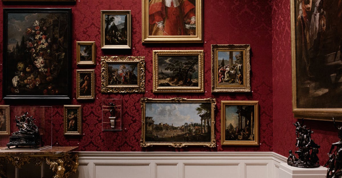
Enhancing Legibility and Readability in Exhibition Graphics
When considering colour for exhibition graphics, it is paramount to select a palette that not only captures attention but also ensures optimal readability. Bright and bold colours may attract viewers' eyes, but if they hinder the legibility of the te...
Read more →
Importance of Legibility and Readability in Exhibition Graphics
When designing exhibition graphics, one of the key considerations should be how to maximise the effectiveness of your displays. This involves creating visuals that are not only visually appealing but also easy to read and comprehend for the audience....
Read more →
Designing Consistent Hierarchy and Layout across Exhibition Graphics
Emphasising key information in exhibition graphics is crucial for effectively communicating messages to the audience. By making important details stand out, visitors can quickly grasp the main points being conveyed. One way to achieve this is by usin...
Read more →
Exploring Different Approaches to Typography Layout in Exhibitions
Expressive typography installations have the power to captivate and engage viewers in unique and compelling ways. By playing with different typefaces, sizes, colours, and arrangements, designers can create visually stunning displays that communicate ...
Read more →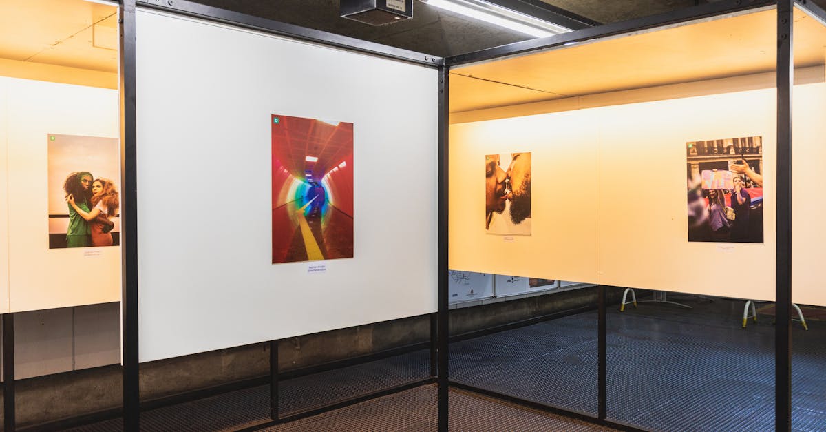
Incorporating Grid Systems for Clear Typography Hierarchy
Different grid systems can greatly impact the overall typography hierarchy in a design. By utilising a grid system, designers can ensure that text elements are visually balanced and cohesive. Grid systems can help establish a sense of order and struc...
Read more →
Creating Emphasis through Hierarchy and Layout in Exhibition Graphics
Incorporating visual cues into exhibition graphics is crucial for capturing the viewer's attention and guiding them through the intended narrative. Visual cues can range from bold colours and shapes to subtle elements that draw the eye towards key in...
Read more →
Understanding the Role of Alignment in Typography Layout
Alignment plays a crucial role in typography layout as it helps to draw the reader's eye to key information. By using alignment strategically, designers can effectively emphasize important text and improve the overall user experience. One commonly us...
Read more →
Balancing Typography Hierarchy with Visual Elements in Exhibitions
Typography hierarchy and visual elements play a crucial role in enhancing the user experience in exhibitions. When visitors interact with an exhibition, the flow of information and content presentation are key factors that influence their engagement....
Read more →
Using Size and Weight for Effective Typography Hierarchy
Typography plays a crucial role in complementing design elements and enhancing the overall visual appeal of a layout. By carefully selecting the right combination of font sizes and weights, designers can create a harmonious balance between text and g...
Read more →
Creating Visual Flow through Hierarchy and Layout
Consistent branding is a fundamental aspect of creating a cohesive visual identity for any project or design. By utilising a unified colour palette, typography style, and design elements throughout, you establish a sense of familiarity and reinforce ...
Read more →
Importance of Hierarchy in Exhibition Graphics
High-quality images play a crucial role in creating impactful exhibition designs that capture the attention of visitors and convey the intended message effectively. In the realm of exhibition graphics, the visual component is paramount, and using hig...
Read more →
Principles of Effective Layout in Exhibition Typography
To create an effective exhibition typography layout that captures the attention of visitors, understanding readability principles is crucial. Readability refers to how easily written text can be read and understood by the audience. It is essential to...
Read more →
Case Studies on Effective Typeface Selection in Exhibition Graphics
In the realm of exhibition graphics, the choice between serif and sans-serif fonts holds significant influence on the overall impact of the design. Serif fonts, characterized by the decorative finishing strokes at the end of characters, often convey ...
Read more →
Typeface Selection Trends in Contemporary Exhibition Design
In the realm of contemporary exhibition design, the selection of typefaces plays a pivotal role in conveying cultural nuances and resonating with diverse audience backgrounds. When curating exhibitions that cater to multicultural audiences, it is ess...
Read more →
Factors to Consider When Selecting Typefaces for Exhibitions
When selecting typefaces for exhibitions, it is crucial to consider the role of emphasis and hierarchy in conveying information effectively to the audience. Emphasis helps to highlight key messages or important details within the exhibition, guiding ...
Read more →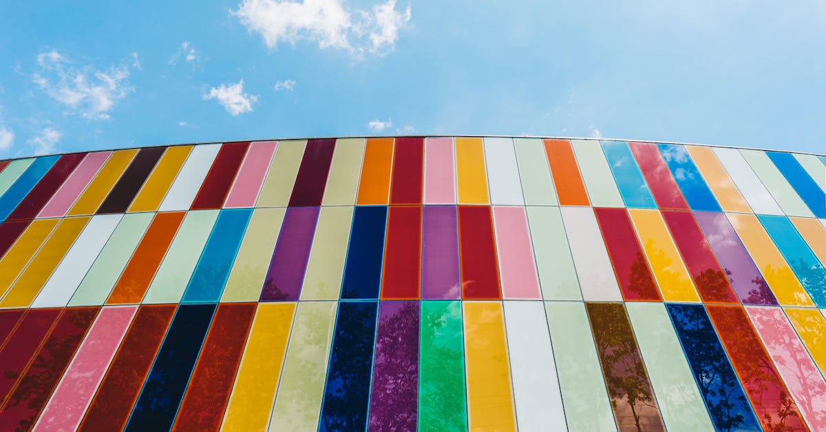
Typeface Selection Strategies for Effective Exhibition Communication
When it comes to selecting typefaces for modern exhibitions, there is a recent trend of revitalising traditional fonts to achieve a unique and appealing visual aesthetic. By incorporating classic typefaces into the design of exhibition materials, suc...
Read more →
How Typeface Selection Enhances Exhibition Messaging
Typography plays a crucial role in guiding exhibition visitors through the visual and informational aspects of an exhibit. By carefully selecting typefaces, sizes, and spacing, designers can lead viewers from one piece to another seamlessly. Through ...
Read more →
Best Practices for Typeface Selection in Exhibition Graphics
When selecting typefaces for exhibition graphics, it is essential to consider how the chosen fonts reflect the theme and essence of the exhibition. Typeface families play a crucial role in conveying the intended message and setting the tone for the o...
Read more →
Impact of Typeface Selection on Audience Perception
The typeface selection on a website plays a crucial role in shaping the audience's perception of its credibility. Research has shown that certain typefaces can evoke feelings of trustworthiness and professionalism, thus influencing how users interact...
Read more →
Exploring Typeface Options for Exhibition Design
Bold and italics are essential tools in typography, allowing designers to create emphasis and guide the viewer's eye across exhibition graphics effectively. When used strategically, bold text can help highlight key information or important details, d...
Read more →
Choosing the Right Typeface for Your Exhibition
Every aspect of your exhibition, from the layout to the colours used, plays a crucial role in shaping the emotional impact on your audience. Typeface choice is no exception to this rule. The font you select can evoke different emotions and set the to...
Read more →
The Importance of Typeface Selection in Exhibition Graphics
Typeface selection plays a pivotal role in achieving overall design harmony within exhibition graphics. The type of font chosen can greatly impact the visual appeal and cohesiveness of the entire display. It is crucial to carefully consider the typog...
Read more →
Balancing Aesthetics and Functionality in Exhibition Spatial Planning
Design elements play a crucial role in shaping the overall aesthetic appeal of an exhibition space. The harmonious blend of colours, textures, shapes, and materials can create a visually engaging environment that captivates the audience. When designi...
Read more →
Spatial Planning Techniques for Creating Memorable Exhibition Graphics
When it comes to exhibition graphics, the production process plays a crucial role in ensuring the final quality of the visuals. From the initial design concept to the printing stage, every step must be executed with precision and attention to detail....
Read more →
Enhancing Visual Flow through Thoughtful Spatial Planning in Exhibition Design
Exhibition design that incorporates various zones for different interactions plays a crucial role in engaging visitors and creating dynamic experiences. By strategically planning and dividing the exhibition space into distinct areas, designers can ca...
Read more →
The Role of Spatial Planning in Guiding Visitors through Exhibition Spaces
Spatial planning plays a pivotal role in shaping visitor behaviour within exhibition spaces. The layout, flow, and design of the space can significantly influence how visitors interact with the exhibits and engage with the overall experience. By stra...
Read more →
Utilizing Spatial Planning to Enhance Audience Engagement at Exhibitions
Technology plays a pivotal role in enhancing audience engagement at exhibitions, providing interactive and immersive experiences. By incorporating augmented reality (AR) and virtual reality (VR) technology, exhibition organisers can transport visitor...
Read more →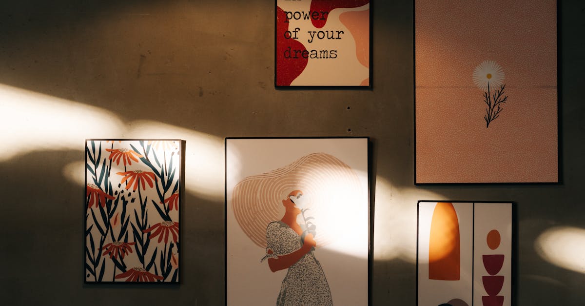
Creating Engaging Experiences through Strategic Spatial Planning
When it comes to creating engaging experiences, strategic spatial planning plays a crucial role in strengthening emotional connections between individuals and the space they inhabit. The arrangement of furniture, lighting, and decor within a space ca...
Read more →
Incorporating Wayfinding into Spatial Planning for Exhibitions
Exhibitions and events attract diverse crowds, making safety a paramount concern for organizers. Wayfinding design plays a crucial role in ensuring the well-being of attendees by guiding them efficiently through the venue. Clear signage, strategicall...
Read more →
Principles of Effective Spatial Planning for Exhibition Graphics
Effective spatial design is crucial for ensuring a positive user experience in exhibition environments. The layout and arrangement of graphics play a significant role in guiding visitors through the space and engaging them with the content on display...
Read more →
Maximizing Space for Impactful Exhibition Graphics
When planning an exhibition, it is crucial to make the most of the available floor space to ensure that your graphics have a strong impact on visitors. One effective strategy is to carefully consider the layout and arrangement of your displays. By cr...
Read more →
Importance of Spatial Planning in Exhibition Graphics Design
Spatial planning plays a crucial role in how users navigate and interact within exhibition spaces. By strategically arranging design elements, such as signage, displays, and interactive features, designers can guide visitors through the space with ea...
Read more →
Interactive Touchscreens in Exhibition Graphic Presentations
Interactive touchscreens are revolutionising the way exhibition graphic presentations are delivered to audiences. With the rapid advancement of technology, these touchscreens offer a dynamic and engaging way to showcase information, products, and ser...
Read more →
The Evolution of Interactive Elements in Exhibition Design
Interactive artifacts have revolutionized the way historical objects are displayed and experienced in museum settings. Through the incorporation of touchscreens, virtual reality, and interactive projections, museums can now offer visitors a more imme...
Read more →
Interactive Installations: A New Dimension in Exhibition Graphics
Interactive installations have revolutionized the way educational content is presented to students of all ages. By incorporating technology into traditional learning environments, such installations have the power to engage and captivate learners in ...
Read more →
Interactive Multimedia in Exhibition Graphic Design
To enhance user experience in exhibition graphic design, it is essential to create a seamless interaction between the audience and multimedia content. Designers should focus on intuitive navigation, clear information hierarchy, and engaging visual el...
Read more →
Creating Immersive Experiences with Interactive Exhibition Graphics
Gamification techniques have become integral in creating interactive exhibition graphics that captivate audiences. By incorporating elements of gamification, such as challenges, rewards, and competition, organisers can elevate the overall experience ...
Read more →
Interactive Displays: A Key Component of Exhibition Graphics
Incorporating interactive displays in booth design has become a crucial element for companies looking to make a lasting impact at exhibitions and trade shows. By integrating interactive technology, businesses can create engaging experiences that attr...
Read more →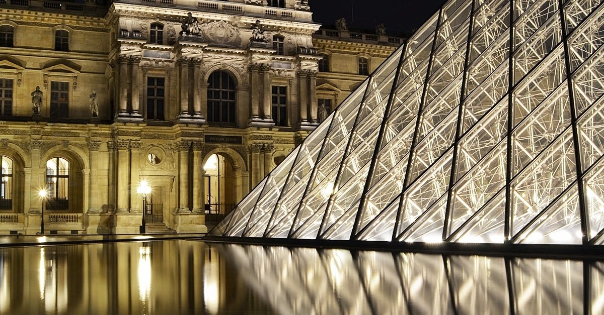
Interactive Elements: Enhancing User Experience in Exhibitions
When it comes to enhancing user experience in exhibitions, customisation plays a vital role in creating a memorable and engaging visit for every individual. By tailoring experiences to meet the unique preferences of users, exhibitions can leave a las...
Read more →
Engaging Visitors Through Interactive Exhibition Graphics
Interactive multimedia has revolutionised the way exhibitions engage with their visitors. By incorporating elements like interactive videos and animations, exhibitors can create memorable experiences that captivate audiences. These dynamic features a...
Read more →
Incorporating Technology into Exhibition Graphic Design
Social media has become an integral part of our daily lives, shaping how we connect, share, and engage with content. When it comes to exhibition graphic design, incorporating social media platforms can greatly enhance the overall experience for atten...
Read more →
The Role of Interactive Elements in Exhibition Graphics
Interactive elements play a crucial role in captivating the attention of exhibition attendees and creating memorable experiences. By incorporating interactive features into exhibition graphics, companies are able to engage with their audience on a de...
Read more →
Maximising Brand Exposure through Strategic Branding in Exhibitions
Social media has emerged as a powerful tool for businesses to generate buzz and create anticipation for upcoming events, including exhibitions. Leveraging platforms such as Facebook, Instagram, and Twitter allows brands to reach a wide audience insta...
Read more →
Enhancing Brand Recognition through Exhibition Graphics
Incorporating technology into exhibition graphics has become increasingly vital in creating engaging and interactive brand experiences. By integrating elements such as virtual reality, augmented reality, touchscreens, and interactive displays, compan...
Read more →
Branding Elements as a Communication Tool in Exhibition Graphics
Designing effective layouts is essential when it comes to showcasing branding elements in exhibition graphics. The layout of the exhibition stand or booth should be carefully planned to ensure that the branding elements are prominently displayed and ...
Read more →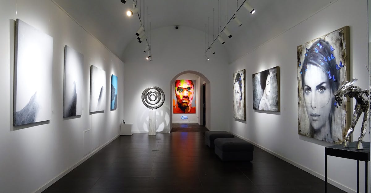
Innovating with Branding Elements in Exhibition Design
Creating memorable brand experiences in exhibition design can be greatly enhanced by incorporating sensory elements into the overall visitor journey. By stimulating the senses of sight, smell, sound, and touch, brands can create a truly immersive env...
Read more →
Impact of Branding Elements on Visitor Engagement
Selecting the right photography and imagery is crucial in capturing visitor engagement on a website or digital platform. Visual elements play a significant role in creating a strong first impression and conveying the brand's identity. High-quality im...
Read more →
Branding Consistency Across Various Exhibition Graphics
To maintain branding consistency across various exhibition graphics, it is crucial to adhere closely to the core values of the brand. These values serve as the foundation for all visual representations of the brand, ensuring that the messaging remain...
Read more →
Utilising Colour and Typography in Exhibition Branding
When designing for exhibitions, the use of colour is paramount in establishing a clear visual hierarchy. Colour can be used effectively to direct attention and guide attendees through the exhibition space. By strategically selecting colours for diffe...
Read more →
Integrating Branding Elements for Effective Exhibition Design
Establishing brand identity is a crucial aspect of exhibition design as it sets the tone for the entire display. Consistency in branding elements such as colours, typography, and logos helps in creating a cohesive and memorable experience for the vis...
Read more →
Creating a Strong Brand Identity for Exhibition Graphics
When it comes to exhibition graphics, emphasising key messages is crucial for effectively communicating with your audience. In order to make a strong impact, it is essential to identify the main messages you want to convey and ensure they are promine...
Read more →
Importance of Branding Elements in Exhibition Graphics
Integrating brand values in graphic design is a crucial aspect of creating effective exhibition graphics that resonate with the target audience. By infusing brand values into the design elements, such as colour schemes, imagery, and overall aesthetic...
Read more →
Mastering Visual Hierarchy for Effective Exhibition Graphics
When it comes to creating compelling exhibition graphics, finding the perfect balance between text and images is crucial for engaging viewers effectively. Text is a powerful tool for conveying information and messages, but it must be used judiciously...
Read more →
The Impact of Visual Hierarchy on Audience Perception in Exhibition Design
Colour psychology plays a fundamental role in shaping the audience's perception and experience within exhibition design. Through the strategic use of colours, designers can evoke specific emotional responses and create an atmosphere that resonates wi...
Read more →
Utilizing Visual Hierarchy to Guide Viewer Engagement in Exhibition Graphics
User experience within an exhibition setting is heavily influenced by the design principles governing the visual elements present. Consistency in these design choices plays a crucial role in enhancing the overall viewer experience. When visitors enco...
Read more →
Visual Hierarchy: A Key Element in Exhibition Design
Creating focal points in exhibition design is essential for capturing the attention of visitors and guiding them through the space effectively. By strategically placing focal points, designers can direct viewers' gaze towards key elements, such as im...
Read more →
Implementing Visual Hierarchy Techniques in Exhibition Graphics
Consistent branding plays a pivotal role in creating a unified and cohesive look across all exhibition graphics. By ensuring that all design elements, colours, fonts, and imagery align with the brand guidelines, exhibitors can establish a strong visu...
Read more →
Enhancing Communication through Visual Hierarchy in Exhibition Design
Navigation systems play a crucial role in guiding visitors through exhibition spaces, ensuring a smooth and seamless exploration experience. By strategically placing clear signage and wayfinding indicators, designers can assist visitors in navigating...
Read more →
Principles of Visual Hierarchy for Exhibition Graphics
White space, also known as negative space, plays a crucial role in exhibition graphics. It is the often overlooked element that can greatly impact the overall design. When used effectively, white space can create a sense of balance, elegance, and sop...
Read more →
Understanding the Role of Visual Hierarchy in Exhibition Graphics
Visual storytelling is a powerful tool in exhibition design, allowing designers to communicate complex messages in a compelling and engaging way. By incorporating visual narratives into exhibition graphics, designers can create a cohesive and memorab...
Read more →
Creating Effective Visual Hierarchy in Exhibition Design
In exhibition design, incorporating visual cues for navigation plays a crucial role in guiding visitors through the space effectively. Visual cues can include signage, colour contrasts, and focal points that help visitors understand the layout and mo...
Read more →
Considering Accessibility in Exhibition Graphics Layout
When designing exhibition graphics, it is crucial to consider creating multisensory experiences that engage visitors on various levels. By incorporating elements that appeal to different senses such as sight, sound, touch, and even smell, you can enh...
Read more →
Understanding Spatial Relationships in Exhibition Graphics Layout
Scale and proportion play fundamental roles in creating visually appealing exhibition graphics. When considering scale, it is crucial to determine the size relationship between various elements within the layout. By adjusting the scale of individual ...
Read more →
Importance of Visual Hierarchy in Exhibition Graphics
Visual hierarchy plays a pivotal role in enhancing information retention within exhibition graphics. By strategically organising content elements based on their significance, the viewer's attention is naturally drawn towards the most critical informa...
Read more →
Incorporating Colour Theory in Exhibition Graphics Layout
Colour temperature plays a vital role in creating the desired effect in exhibition design. Warm colours, such as reds, yellows, and oranges, are known to evoke feelings of energy, passion, and warmth. When incorporated strategically, these hues can d...
Read more →
Incorporating Typography in Exhibition Graphics Layout
Typography plays a crucial role in exhibition designs by ensuring accessibility for all viewers. Thoughtful selection of fonts, sizes, and spacing can greatly impact how information is perceived and understood. When designing exhibition graphics, it ...
Read more →
Utilising Grid Systems for Effective Exhibition Graphics Layout
Grid-based exhibition graphics play a crucial role in enhancing the overall user experience at events. By utilising a structured grid system, designers can create layouts that are visually pleasing and easy to navigate for attendees. The consistency ...
Read more →
Achieving Balance and Harmony in Exhibition Graphics Layout
Achieving a harmonious balance between text and visual elements is essential in creating an effective exhibition graphics layout. The text should complement the visuals, providing necessary information without overwhelming the design. By carefully co...
Read more →
Creating Impactful Visual Flow in Exhibition Graphic Layout
A crucial aspect of exhibition graphic layout is the ability to direct the viewer's eye towards key elements and information. This can be achieved through strategic placement of visual elements such as images, text, and graphics. By carefully arrangi...
Read more →
Maximising Space and Flow in Exhibition Graphics Layout
When designing exhibition graphics, it is essential to utilise colour psychology to evoke specific responses from attendees. Colour plays a crucial role in influencing emotions, perceptions, and behaviours. Understanding the impact of colours can hel...
Read more →
Principles of Effective Layout Design for Exhibitions
When designing an exhibition layout, one of the key aspects to consider is how to effectively showcase products and services. This involves strategically placing the main highlights in prominent areas that are easily visible to visitors. Products sho...
Read more →
Importance of Effective Layout in Exhibition Graphics
Creative typography plays a crucial role in the effectiveness of exhibition graphics. Utilising innovative fonts, sizes, and styles can add a unique flair to the design, instantly capturing the attention of viewers. By choosing the right typography, ...
Read more →