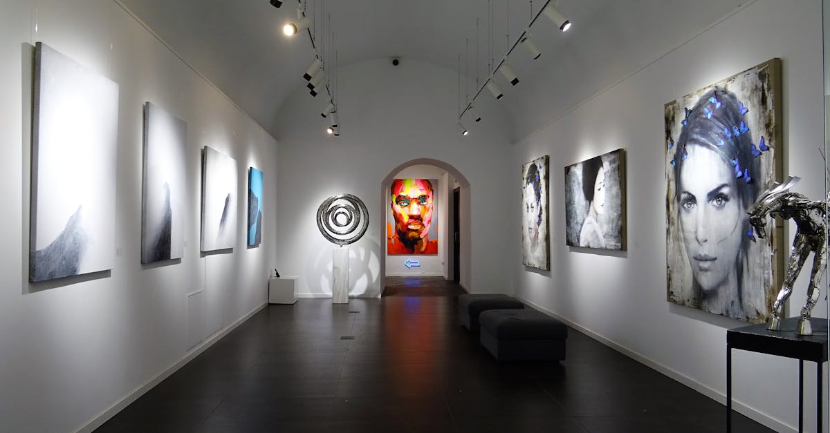
Innovating with Branding Elements in Exhibition Design
Creating Memorable Brand Experiences with Sensory Elements
Creating memorable brand experiences in exhibition design can be greatly enhanced by incorporating sensory elements into the overall visitor journey. By stimulating the senses of sight, smell, sound, and touch, brands can create a truly immersive environment that engages attendees on a deeper level. For example, incorporating a signature scent that is synonymous with the brand can instantly transport visitors to the brand's world, triggering powerful emotional connections and leaving a lasting impression.
In addition to scent, sound can play a crucial role in shaping brand experiences within exhibitions. Whether it's through subtle background music, interactive audio installations, or even branded sound effects, the auditory aspect of the environment can help reinforce brand messaging and create a cohesive brand identity. Furthermore, incorporating tactile elements such as textured materials, interactive displays, or hands-on experiences can further engage visitors and create a multi-sensory experience that sets the brand apart. By strategically integrating sensory elements, brands can create a truly unforgettable exhibition experience that resonates with attendees long after they have left the event.
Stimulating Senses Through Scent, Sound, and Texture
Exhibition designers are increasingly harnessing the power of sensory elements to create immersive brand experiences. By tapping into the senses of smell, hearing, and touch, brands can forge deeper connections with their audience, leaving a lasting impression that goes beyond visual aesthetics. Scent, in particular, has a strong ability to evoke emotions and memories, making it a potent tool for enhancing brand engagement. Employing signature scents that align with the brand's identity can instantly transport visitors to a familiar and comforting space, reinforcing brand recall and loyalty.
The strategic use of sound can also play a crucial role in influencing visitor perceptions within an exhibition space. Whether it's through ambient music, informative audio guides, or interactive sound installations, auditory stimuli can significantly impact the overall atmosphere and mood of the brand experience. By carefully selecting sound elements that resonate with the brand's narrative and values, designers can create a multi-dimensional sensory journey that captivates visitors on a deeper level. Texture, another sensory dimension often overlooked, can further enrich the tactile experience, offering tactile cues that enhance the overall sensorial landscape of the exhibition design.
Implementing Sustainable Branding Practices in Exhibition Design
Sustainability is becoming increasingly central in exhibition design, with brands aiming to reduce their environmental footprint while engaging with audiences. Implementing sustainable branding practices is a strategic choice that aligns businesses with the growing global emphasis on environmental responsibility. By integrating eco-friendly materials and technologies into exhibition design, brands can showcase their commitment to sustainability and appeal to environmentally conscious consumers.
Incorporating sustainable branding solutions into exhibition design involves a holistic approach that considers every aspect of the experience. From the materials used in booth construction to the energy efficiency of lighting and technology systems, each decision contributes to the overall sustainability of the exhibition. By prioritising sustainability in branding practices, businesses not only demonstrate their environmental values but also differentiate themselves in a competitive market where consumers increasingly prefer eco-conscious brands.
Showcasing EcoFriendly Branding Solutions
Exhibition designers are increasingly turning to eco-friendly branding solutions to convey a message of sustainability and environmental consciousness. By integrating elements such as recycled materials, biodegradable components, and energy-efficient lighting into their designs, brands are able to showcase their commitment to reducing their ecological footprint. Not only does this approach align with the growing global focus on sustainability, but it also helps brands differentiate themselves in a crowded marketplace by appealing to environmentally conscious consumers.
In addition to using sustainable materials in their exhibition designs, brands are also exploring innovative ways to reduce waste and promote recycling. For example, some companies are incorporating interactive displays that educate visitors on the importance of recycling and offer practical tips on how to minimise waste in their daily lives. By actively engaging visitors in the conversation around environmental responsibility, brands can create a lasting impression and foster a sense of connection with their audience based on shared values of sustainability.
Personalising Visitor Experiences with DataDriven Branding
Data-driven branding has revolutionised the way exhibition designers personalise visitor experiences. By harnessing the power of visitor data, brands can create customised interactions that resonate with each individual on a deeper level. Understanding visitor preferences, behaviours, and demographics allows designers to tailor the exhibition journey to cater to the unique needs and interests of each guest.
One significant advantage of data-driven branding in exhibition design is the ability to provide a seamless and cohesive experience for visitors. By analysing data on visitor interactions, designers can create a consistent narrative that guides guests through the exhibition in a way that feels personalised and intuitive. This personalised approach not only enhances visitor engagement but also strengthens brand loyalty by forging a stronger connection between the brand and the visitor.
Using Visitor Data to Customise Brand Interactions
Visitor data plays a crucial role in exhibition design, allowing brands to tailor their interactions with attendees on a personalized level. By utilizing data analytics, brands can gain insights into visitors' preferences, behaviours, and interests, enabling them to create engaging and relevant brand experiences. This data-driven approach not only enhances the overall visitor experience but also strengthens brand loyalty and connection.
Through the analysis of visitor data, brands can segment their audience to deliver targeted content and interactions that resonate with specific demographics or interests. By customizing brand interactions based on visitors' profiles and past interactions, brands can create a more immersive and memorable experience for attendees. This level of personalization fosters a deeper emotional connection with the brand, leaving a lasting impression and increasing the likelihood of post-event engagement.
FAQS
What are some ways to create memorable brand experiences in exhibition design?
One way to create memorable brand experiences in exhibition design is by incorporating sensory elements such as scent, sound, and texture that engage visitors on a deeper level.
How can scent, sound, and texture be used to stimulate the senses in exhibition design?
Scent, sound, and texture can be strategically used in exhibition design to evoke emotions, enhance brand recall, and create a unique and immersive experience for visitors.
How can sustainable branding practices be implemented in exhibition design?
Sustainable branding practices can be implemented in exhibition design by showcasing eco-friendly branding solutions that align with the brand's values and resonate with environmentally conscious visitors.
What are some examples of eco-friendly branding solutions that can be showcased in exhibitions?
Examples of eco-friendly branding solutions that can be showcased in exhibitions include using recycled materials, reducing waste, incorporating energy-efficient lighting, and promoting sustainable practices.
How can visitor data be utilised to personalise brand interactions in exhibitions?
Visitor data can be utilised to personalise brand interactions in exhibitions by collecting and analysing data to understand visitor preferences, behaviours, and demographics, and then customising the exhibition experience to cater to their specific needs and interests.
Related Links
Branding Elements as a Communication Tool in Exhibition GraphicsImpact of Branding Elements on Visitor Engagement
Maximising Brand Exposure through Strategic Branding in Exhibitions
Enhancing Brand Recognition through Exhibition Graphics
Branding Consistency Across Various Exhibition Graphics
Utilising Colour and Typography in Exhibition Branding