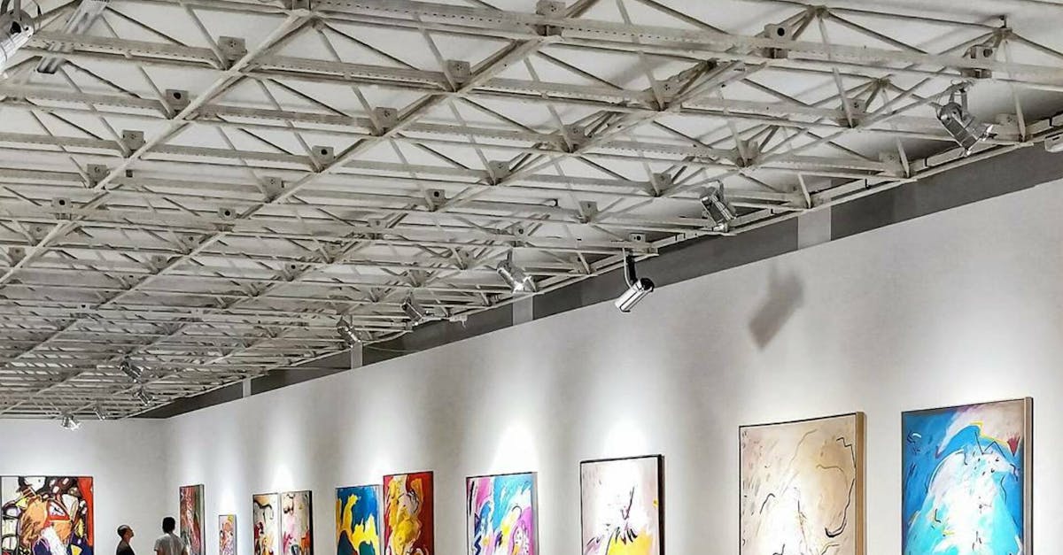
Creating a Strong Brand Identity for Exhibition Graphics
Emphasising Key Messages
When it comes to exhibition graphics, emphasising key messages is crucial for effectively communicating with your audience. In order to make a strong impact, it is essential to identify the main messages you want to convey and ensure they are prominently featured in your designs. By focusing on key messages, you can capture the attention of visitors and leave a lasting impression.
Highlighting important information in your exhibition graphics can be achieved through strategic placement and typography choices. Use bold colours, fonts, and graphics to draw attention to key points and make them easily readable. By making your messages clear and concise, you can create a visually appealing display that resonates with your target audience.
Highlighting important information for maximum impact
To ensure that your exhibition graphics effectively communicate your key messages, it is crucial to highlight important information in a way that captures the attention of your target audience. By strategically emphasising key details such as event dates, booth numbers, or promotional offers, you can create a visual hierarchy that guides viewers towards the most significant information. Utilising bold fonts, contrasting colours, or larger text sizes can help draw the eye to essential details, ensuring they are not overlooked in the display.
Moreover, when designing your exhibition graphics, consider the placement of critical information to maximise its impact. Placing important details at eye level or in prominent areas of the graphic can significantly enhance their visibility and ensure that they leave a lasting impression on attendees. By organising information in a clear and structured manner, you can help viewers navigate the content easily and focus on the key messages you wish to convey.
Creating Visual Hierarchies
Creating visual hierarchies is essential in ensuring that your exhibition graphics effectively communicate your message to your target audience. By organising your content in a clear and structured manner, you can guide viewers' attention towards the most important information first. This helps in creating a seamless flow of information that is easy to digest and leaves a lasting impact on your audience.
One effective way to establish visual hierarchies is by varying the size, colour, and placement of different elements within your graphics. By strategically highlighting key messages and important details through larger fonts, bold colours, or prominent positioning, you can draw viewers' eyes to the most critical information. This technique not only enhances the overall design aesthetics but also ensures that your audience grasps the main points of your exhibition display at a glance.
Organising content in a clear and structured manner
Organising your content in a clear and structured manner is essential for ensuring that your exhibition graphics effectively communicate your message to your target audience. By carefully arranging your information, you can guide the viewer's eye and lead them through the key points of your display without causing confusion or overwhelm. Consider breaking down your content into sections that flow logically from one to the next, guiding the viewer through a cohesive narrative that highlights the most important aspects of your brand or product.
Utilise a hierarchy of text sizes and styles to help emphasise key information and create visual interest. By using different font sizes, bolding, and colour variations, you can draw attention to important details while maintaining a cohesive look throughout your graphics. Additionally, make sure to leave enough white space around each piece of information to prevent overcrowding and allow important details to stand out. Lastly, consider the overall flow of information on your graphics to ensure that viewers can easily navigate through the content and absorb the key messages you want to convey.
Utilising HighQuality Printing Techniques
When creating exhibition graphics, one crucial aspect to consider is the utilisation of high-quality printing techniques. The choice of printing method can significantly impact the overall look and effectiveness of your graphics. Investing in superior printing techniques can enhance the clarity, vibrancy, and durability of your visual materials, making them more appealing and engaging to your target audience.
High-quality printing techniques not only ensure that your exhibition graphics look professional, but they also communicate a sense of quality and attention to detail to your audience. Whether you opt for digital printing, offset printing, or other specialised printing methods, it is essential to work with a reputable printing company that can deliver exceptional results. By prioritising printing quality, you can elevate the visual appeal of your exhibition graphics and leave a lasting impression on visitors.
Investing in printing methods that enhance the overall look of your graphics
When it comes to creating exhibition graphics that leave a lasting impression, investing in high-quality printing techniques is paramount. The printing methods chosen can significantly impact the overall look and feel of the graphics, helping to elevate the brand identity that you aim to establish. Opting for advanced printing techniques can enhance the clarity, vibrancy, and overall visual appeal of your graphics, making them more captivating and memorable to your target audience.
Using cutting-edge printing technology and high-quality materials can help ensure that your exhibition graphics stand out amongst the competition. From selecting the right paper stock to choosing the appropriate finish, every detail matters when it comes to enhancing the overall look of your graphics. By prioritising superior printing methods, you can effectively communicate your brand message, capture the attention of attendees, and create a strong visual presence that resonates with your audience.
FAQS
How important is it to emphasise key messages in exhibition graphics?
Emphasising key messages in exhibition graphics is crucial as it helps in communicating the core values and offerings of your brand clearly to the audience.
Why is highlighting important information essential for maximum impact in exhibition graphics?
Highlighting important information in exhibition graphics ensures that the key details stand out and are easily noticeable, leading to better engagement and understanding among viewers.
How can creating visual hierarchies improve the effectiveness of exhibition graphics?
Creating visual hierarchies in exhibition graphics helps in guiding the viewers' eyes towards the most important elements first, making the overall design more impactful and organised.
What are the benefits of organising content in a clear and structured manner in exhibition graphics?
Organising content in a clear and structured manner in exhibition graphics enhances readability, reduces clutter, and makes it easier for the audience to grasp the information being presented.
Why is it important to utilise high-quality printing techniques for exhibition graphics?
Utilising high-quality printing techniques for exhibition graphics is essential as it enhances the overall look and feel of the graphics, making them more visually appealing and professional.
Related Links
Integrating Branding Elements for Effective Exhibition DesignImportance of Branding Elements in Exhibition Graphics
Maximising Brand Exposure through Strategic Branding in Exhibitions
Enhancing Brand Recognition through Exhibition Graphics
Branding Elements as a Communication Tool in Exhibition Graphics
Innovating with Branding Elements in Exhibition Design