Understanding the Emotional Impact of Colour in Exhibition Design
Enhancing User Experience Through Colour
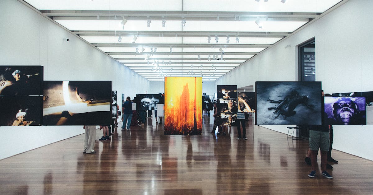
Creating a cohesive and visually appealing colour scheme in exhibition design can significantly enhance the overall user experience. Colours have the power to evoke emotions, convey messages, and influence how visitors perceive and interact with the exhibits. By carefully selecting colours that complement each other and align with the intended mood or theme of the exhibition, designers can effectively captivate the audience and leave a lasting impression.
Moreover, the strategic use of colour can help guide viewers through the exhibition space, highlighting key elements, encouraging exploration, and creating a sense of flow and coherence. By utilising contrasting colours for focal points or important information, designers can draw visitors' attention and create visual interest, ultimately enhancing the overall engagement and understanding of the exhibition content.
Guiding Viewer Perception with Strategic Colour Placement
Colour plays a crucial role in guiding viewer perception within an exhibition space. By strategically placing colours throughout the exhibit, designers can lead viewers through a visual journey that evokes specific emotions and responses. Understanding the psychological impact of colours is essential in creating a cohesive experience that resonates with the audience.
Strategic colour placement can influence how viewers interpret and interact with different elements within an exhibition. Warm colours like reds and oranges can evoke feelings of excitement and passion, while cool colours such as blues and greens can create a sense of calm and tranquillity. By strategically using a combination of colours, designers can direct the viewer's focus, create a sense of harmony, and ultimately enhance the overall impact of the exhibition design.
Importance of Consistency in Colour Application
Consistency in colour application is a crucial aspect of exhibition design that often goes unnoticed by visitors. When colours are applied consistently throughout an exhibit, it creates a sense of cohesion and unity that enhances the overall aesthetic appeal. This uniformity helps to guide visitors through the exhibit smoothly, without distractions or jarring visual contrasts that could disrupt the intended experience.
Moreover, consistent use of colour can also reinforce key messages or themes within the exhibit. By repeating certain colours or colour schemes strategically, designers can create visual cues that prompt viewers to make connections between different elements of the exhibit. This subconscious reinforcement can help to solidify the overall impact of the exhibit and ensure that visitors leave with a clear understanding of the intended message or narrative.
Establishing Brand Identity Through Colour in Exhibits
Establishing a strong brand identity is crucial for any successful exhibition design. Colour plays a significant role in creating a memorable and impactful brand image that resonates with visitors. By carefully selecting a consistent colour palette that aligns with the brand's values and messaging, exhibitors can effectively communicate their identity to the audience.
Using colours that are associated with the brand can help visitors to easily identify and connect with the exhibition space. Consistency in colour application across various elements such as signage, displays, and promotional materials reinforces brand recognition and strengthens the overall brand identity. Bold and unique colour choices can enhance the visual appeal of the exhibit, leaving a lasting impression on visitors and solidifying the brand's presence in their minds.
Impact of Lighting on Colour Perception
Lighting plays a crucial role in how colours are perceived within exhibition spaces. The intensity and direction of light can significantly affect the way colours appear to viewers. Bright lighting can make colours more vibrant and eye-catching, while dim lighting can create a more subdued and intimate atmosphere. It is important for exhibition designers to carefully consider the impact of lighting on the colours used in their displays to evoke the desired emotional responses from visitors.
Furthermore, natural light and artificial light sources can create different effects on colours within an exhibition. Natural light can bring out the truest hues of colours and create a sense of freshness and authenticity in the display. On the other hand, artificial lighting allows for more control over the intensity and colour temperature, enabling designers to create specific moods and focal points. By strategically combining natural and artificial lighting sources, exhibition designers can enhance the overall visual impact of their displays and guide viewers' emotional responses.
Utilising Different Lighting Techniques to Enhance Colour Effects
Lighting plays a crucial role in enhancing the visual impact of colours within an exhibition space. By strategically using different lighting techniques, designers can create dynamic and engaging environments that captivate viewers. One effective technique is to use spotlighting to draw attention to specific elements or areas within the exhibit. This focused light can intensify the colours, creating a visually striking focal point that immediately grabs the viewer's attention.
In addition to spotlighting, designers can also utilise diffused lighting to create a more ambient and inviting atmosphere. Soft, even lighting can help to blend colours seamlessly and create a harmonious visual experience for visitors. By carefully balancing the use of spotlighting and diffused lighting, designers can manipulate the perception of colour within the exhibition space, evoking different emotions and responses from viewers. Ultimately, the strategic use of lighting techniques can elevate the overall impact of colour in exhibition design, leaving a lasting impression on those who interact with the space.
FAQS
How does colour impact the emotional experience of visitors in an exhibition?
Colour plays a crucial role in influencing the emotional experience of visitors in an exhibition. Different colours can evoke different feelings and moods, ultimately shaping the overall perception of the exhibit.
Why is consistency in colour application important in exhibition design?
Consistency in colour application is vital in exhibition design as it helps to create a cohesive and harmonious visual experience for visitors. It ensures that the intended message or branding is effectively communicated through the use of colour.
How can lighting affect the perception of colour in an exhibition?
Lighting has a significant impact on the perception of colour in an exhibition. Different lighting techniques can alter the way colours are perceived, highlighting certain aspects and creating a specific ambiance that enhances the overall visual appeal.
What role does strategic colour placement play in guiding viewer perception in an exhibition?
Strategic colour placement is essential in guiding viewer perception in an exhibition. By strategically placing colours in specific areas, designers can direct the viewer's attention, create focal points, and control the flow of movement throughout the exhibit.
How can colour be used to establish brand identity in exhibition design?
Colour can be a powerful tool in establishing brand identity in exhibition design. By using consistent brand colours throughout the exhibit, designers can reinforce brand recognition, create a strong visual identity, and leave a lasting impression on visitors.
Related Links
Utilizing Colour Psychology to Enhance Exhibition GraphicsThe Influence of Colour Psychology in Exhibition Graphics
The Power of Colour Psychology in Capturing Attention in Exhibition Displays
Leveraging Colour Psychology for Effective Exhibition Graphics
Creating Memorable Exhibition Experiences with Colour Psychology
Enhancing Audience Engagement through Colour Psychology in Exhibition Graphics