Enhancing Visual Appeal through Colour Application in Exhibition Graphics
Embracing Trends in Colour Usage for Modern Exhibitions
In the realm of modern exhibitions, the application of colour plays a crucial role in captivating the attention of attendees and conveying the intended message effectively. A key trend that has emerged in recent years is the use of bold and vibrant colours to create visually striking displays that leave a lasting impression on visitors. By incorporating these eye-catching hues into exhibition graphics, designers can inject a sense of energy and excitement into the space, making it more engaging and memorable for all who interact with it.
Furthermore, the strategic use of colour in exhibition design can help to establish a cohesive visual identity that aligns with the brand or theme being showcased. By selecting a palette that reflects the values and personality of the exhibitor, organisers can strengthen their messaging and create a sense of unity throughout the display. This harmonious integration of colour not only enhances the overall aesthetic appeal of the exhibition but also serves to reinforce brand recognition and recall among attendees long after the event has ended.
Implementing Bold and Vibrant Colours for Contemporary Appeal
Bold and vibrant colours play a crucial role in capturing the attention of contemporary audiences in exhibitions. When it comes to setting a modern tone and engaging visitors, incorporating striking hues can significantly enhance the overall visual appeal of exhibition graphics. These colours have the power to evoke emotions, create interest, and leave a lasting impression on attendees, making them an essential element in exhibition design.
By strategically implementing bold and vibrant colours in exhibition graphics, designers can add a dynamic and energetic feel to the space. Vibrant shades like electric blue, neon green, and fiery red can inject a sense of excitement and modernity into the overall design scheme. Moreover, these colours can help differentiate various sections of the exhibition, guide attendees through the space, and draw their attention to key focal points effectively.
Harmonising Colour with Lighting for Maximum Impact
Choosing the right lighting to complement the colour scheme of your exhibition graphics can significantly enhance the overall impact and visual appeal of your display. The harmonisation of colour with lighting is a powerful tool that can help create a cohesive and visually striking experience for visitors. By carefully selecting lighting options that complement the colours used in your graphics, you can draw attention to key elements, create focal points, and set the tone for the entire exhibition space.
One effective way to harmonise colour with lighting is to use warm or cool lighting tones to enhance the mood and atmosphere of the exhibition. Warm lighting can create a welcoming and inviting feel, while cool lighting can help convey a sense of modernity and sophistication. By strategically placing lighting fixtures and adjusting their intensity, you can highlight specific colours in your graphics, create depth and dimension, and evoke specific emotional responses from visitors. The key is to experiment with different lighting options during the design process to find the perfect balance that maximises the impact of your colour choices.
Enhancing Mood and Atmosphere with Thoughtful Lighting Choices
Lighting plays a crucial role in setting the mood and atmosphere of an exhibition space. By carefully selecting lighting choices, exhibitors can create a captivating environment that draws visitors in and showcases their products effectively. Thoughtful use of lighting can evoke emotions, highlight key features, and guide the attention of attendees throughout the exhibition.
When considering lighting options, it is important to pay attention to the intensity, direction, and colour temperature of the lights being used. Brighter lights can create a sense of energy and excitement, while softer, ambient lighting can generate a more relaxed and inviting atmosphere. By strategically placing lights to illuminate specific areas or products, exhibitors can direct the focus of the audience and create visual interest within the space.
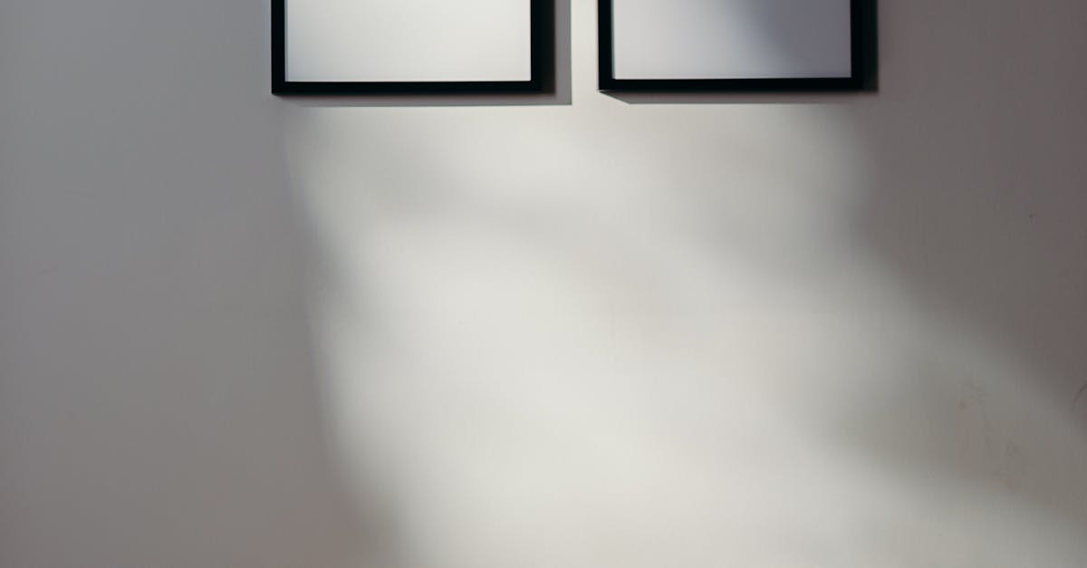
Utilising Neutral Backgrounds to Enhance Product Visibility
Utilising neutral backgrounds in exhibition graphics can significantly enhance the visibility of products on display. By opting for soft, muted tones such as beige, grey, or white, the focus is drawn towards the showcased items rather than overpowering them with bold colours or intricate patterns. This simple yet effective approach creates a clean and sophisticated aesthetic, allowing products to stand out effortlessly against the understated backdrop.
Neutral backgrounds provide a versatile canvas that complements various products regardless of their shape, size, or colour. Whether it is intricate jewellery, vibrant artwork, or sleek electronic gadgets, a neutral backdrop ensures that each item is showcased elegantly without any distractions. This design choice not only highlights the key features of the products but also creates a cohesive and harmonious visual display that appeals to the audience's aesthetic sensibilities.
Allowing Products to Stand Out Against Subtle Colour Schemes
Subtle colour schemes can provide an elegant backdrop that allows products to shine on their own merits. By employing neutral tones and muted hues in exhibition graphics, the focus is drawn towards the showcased items without overwhelming the viewer with a cacophony of colours. This approach not only creates a sophisticated and cohesive aesthetic but also enhances the visual appeal by directing attention to the products themselves.
Neutral backgrounds serve as a canvas onto which products can emerge as focal points, grabbing the attention of attendees and engaging them in a more impactful way. Such understated colour schemes create a sense of visual balance and tranquillity, allowing consumers to focus on the unique features and attributes of the exhibited items. In a sea of bright and bold visuals commonly found in exhibitions, the subtlety of a neutral background can be a powerful tool in ensuring that products stand out and attract interest effectively.
FAQS
How important is colour application in exhibition graphics?
Colour application in exhibition graphics is crucial as it can enhance visual appeal, convey brand messaging, evoke emotions, and attract the attention of the audience.
What are some current trends in colour usage for modern exhibitions?
Current trends in colour usage for modern exhibitions include embracing bold and vibrant colours, using contrasting colour schemes, and incorporating gradients and patterns to create visual interest.
How can lighting be harmonised with colour for maximum impact in exhibition graphics?
Lighting can be harmonised with colour by considering the intensity and temperature of the light, using lighting to enhance the vibrancy of colours, and creating a dynamic interplay between light and colour to draw attention to key elements.
How does colour and lighting choices affect the mood and atmosphere of an exhibition?
Thoughtful colour and lighting choices can significantly impact the mood and atmosphere of an exhibition by creating a sense of warmth, excitement, sophistication, or relaxation, depending on the desired ambiance.
Why is it important to utilise neutral backgrounds in exhibition graphics?
Utilising neutral backgrounds in exhibition graphics helps to enhance product visibility, prevent visual clutter, and provide a versatile canvas for showcasing products or artworks effectively.
Related Links
Case Studies on Successful Colour Application in Exhibition GraphicsBest Practices for Colour Application in Exhibition Graphics
Incorporating Colour Theory into Exhibition Graphics
Choosing the Right Colour Palette for Exhibition Graphics
Impact of Colour Contrast in Exhibition Graphics
Utilising Colour Psychology in Exhibition Graphics