Principles of Effective Layout in Exhibition Typography
Understanding Readability Principles
To create an effective exhibition typography layout that captures the attention of visitors, understanding readability principles is crucial. Readability refers to how easily written text can be read and understood by the audience. It is essential to choose fonts and text sizes that are legible and clear from a distance, ensuring that the message is communicated effectively.
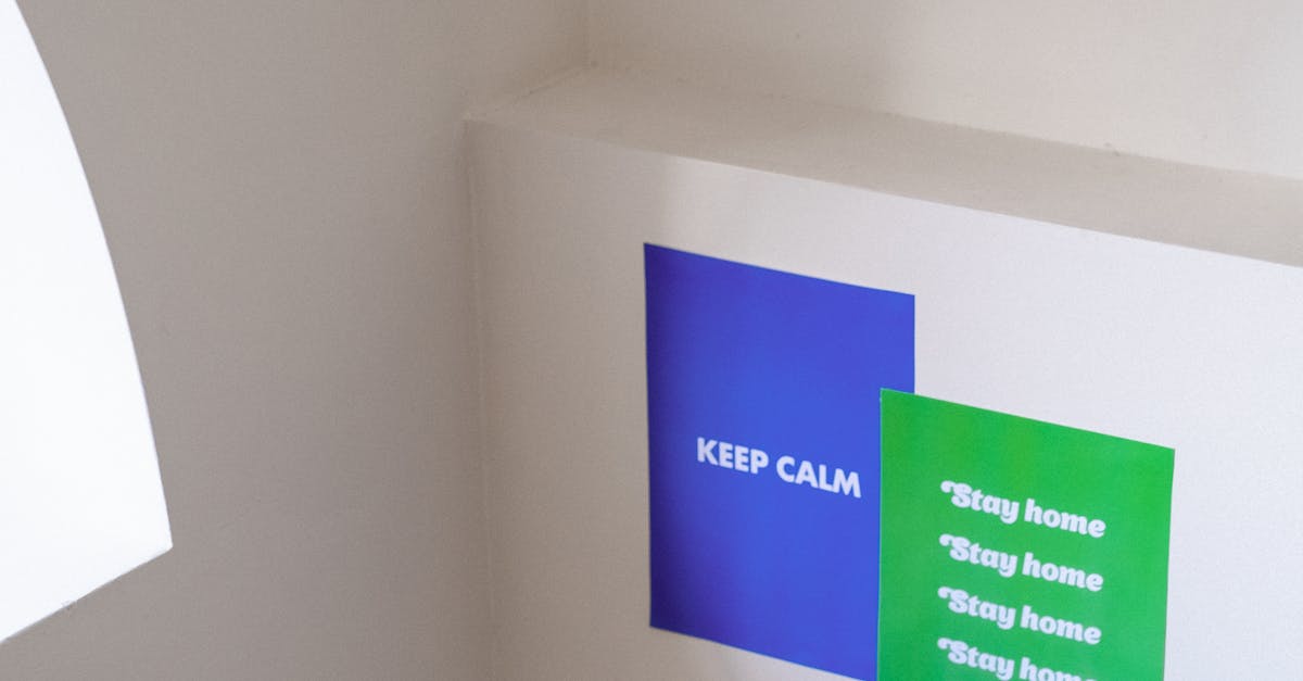
Moreover, consider the contrast between the text and background to enhance readability. A high level of contrast, such as black text on a white background or vice versa, can significantly improve the legibility of the content. Additionally, maintaining consistent spacing between lines and paragraphs can help improve readability and make it easier for visitors to navigate the information presented at the exhibition. By prioritising readability in exhibition typography, you can ensure that the message is communicated clearly and effectively to all attendees.
Using Legible Fonts and Optimal Text Sizes
When considering the layout of exhibition typography, selecting legible fonts and appropriate text sizes is crucial for ensuring information is easily readable by attendees. Opting for clean, sans-serif fonts like Arial or Helvetica can enhance readability, especially when used in body text. These fonts are simple and straightforward, making them ideal for conveying information clearly without causing any distractions that may arise from elaborate or decorative typefaces. Furthermore, selecting optimal text sizes is essential to ensure that content can be read comfortably from various distances within the exhibition space.
It is recommended to use a font size of at least 16 points for body text, as this size strikes a balance between being large enough to read from a distance and small enough to accommodate sufficient information on displays. Headings and titles can be set in larger sizes, such as 20 points or above, to differentiate them from body text and attract visitors' attention. By prioritising legibility and choosing suitable text sizes, exhibition designers can create a visually engaging layout that effectively communicates key messages to attendees without causing unnecessary strain on their reading experience.
Incorporating Brand Identity
Incorporating brand identity into exhibition typography plays a crucial role in communicating the essence of a company or organisation to the audience. Consistency in font choice, colour schemes, and overall visual elements helps to strengthen brand recognition and create a cohesive look throughout the exhibition space. By aligning the typography with established brand guidelines, exhibitors can effectively convey their unique identity and make a memorable impression on visitors.
When integrating brand identity into typography, it is essential to consider the overall tone and personality of the brand. Whether the brand is modern and innovative or traditional and sophisticated, the typography should reflect these characteristics. Choosing fonts that resonate with the brand's image and values, along with incorporating the brand's colour palette, can enhance the overall aesthetic appeal and reinforce brand recall among attendees. By carefully aligning typography with brand guidelines, exhibitors can create a visually appealing and immersive experience that resonates with visitors long after they have left the exhibition space.
Aligning Typography with Brand Guidelines
Typography plays a crucial role in conveying brand identity and consistency in an exhibition layout. Ensuring that the typography aligns with the brand guidelines helps in establishing a cohesive and professional look. By using fonts that are specified in the brand style guide, you can maintain uniformity and strengthen brand recognition among the audience.
Consistency in typography across various exhibition materials such as banners, brochures, and posters is key to reinforcing brand identity. Adhering to the specified font sizes, styles, and colours outlined in the brand guidelines creates a harmonious visual language that reflects the essence of the brand. When typography is aligned with brand guidelines, it not only enhances the overall aesthetic appeal but also reinforces brand recall in the minds of visitors.
Emphasising Key Information
When designing exhibition typography, it is crucial to emphasize key information effectively to ensure that important details are highlighted for visitors. One way to achieve this is by using different formatting styles such as bold and italics to make significant details stand out. By strategically employing these styles, exhibitors can guide the audience's attention towards essential messages and key points.
Bold text can be particularly useful in drawing attention to important information that needs to be highlighted. Whether it is highlighting key dates, event schedules, or standout features, bold typography can help in making crucial details more noticeable amidst a sea of text and visuals. Similarly, using italics can add a touch of emphasis to specific words or phrases, allowing them to stand out without overwhelming the overall design. By judiciously using bold and italics, exhibitors can effectively emphasize key information and ensure that visitors grasp the most critical aspects of the exhibition at a glance.
Employing Bold and Italics to Highlight Important Details
When designing exhibition typography, employing bold and italics can play a significant role in highlighting important details within the content. Bold text can draw attention to key information, making it stand out to visitors as they navigate through the exhibition space. It is essential to use bold strategically, emphasizing only the most crucial points to avoid overwhelming the audience with too much visual weight.
Similarly, italicizing certain text can provide a subtle emphasis that guides the viewer's eye towards specific details. By using italics sparingly, you can create a visual hierarchy that helps visitors prioritize the information presented in the exhibition. When used in conjunction with bold text, italics can help differentiate between different levels of importance, ensuring that essential details are easily discernible amidst the visual noise of the display.
FAQS
How important is readability in exhibition typography layout?
Readability is crucial in exhibition typography layout as it ensures that visitors can easily comprehend the displayed information without any difficulty.
Why is it essential to use legible fonts and optimal text sizes in exhibition typography?
Using legible fonts and optimal text sizes in exhibition typography helps in enhancing the readability of the content and ensures that the information is easily accessible to the audience.
How does incorporating brand identity contribute to the effectiveness of exhibition typography layout?
Incorporating brand identity in exhibition typography helps in creating a cohesive and consistent visual representation of the brand, making it easier for visitors to identify and connect with the brand.
What is the significance of aligning typography with brand guidelines in exhibition design?
Aligning typography with brand guidelines in exhibition design helps in maintaining brand consistency and ensuring that the typography reflects the values and personality of the brand effectively.
How can bold and italics be effectively used to highlight important details in exhibition typography?
Bold and italics can be employed in exhibition typography to draw attention to key information, create hierarchy, and emphasize important details that visitors need to focus on while navigating the exhibition.
Related Links
Importance of Hierarchy in Exhibition GraphicsDesigning Consistent Hierarchy and Layout across Exhibition Graphics
Exploring Different Approaches to Typography Layout in Exhibitions
Incorporating Grid Systems for Clear Typography Hierarchy
Creating Emphasis through Hierarchy and Layout in Exhibition Graphics
Understanding the Role of Alignment in Typography Layout