Enhancing Communication through Visual Hierarchy in Exhibition Design
Integrating Navigation Systems for Seamless Exploration
Navigation systems play a crucial role in guiding visitors through exhibition spaces, ensuring a smooth and seamless exploration experience. By strategically placing clear signage and wayfinding indicators, designers can assist visitors in navigating the exhibit effortlessly. The integration of digital maps or interactive displays can further enhance the visitor's ability to locate specific areas of interest within the exhibition, fostering a sense of direction and purpose as they move through the space.
Incorporating intuitive navigation systems also contributes to the overall accessibility of the exhibition, catering to visitors with varied levels of familiarity with the space. By providing clear and concise directional cues, designers can create a user-friendly environment that encourages exploration and engagement. Additionally, the strategic placement of navigation aids can help manage visitor flow and prevent congestion, ensuring that everyone has the opportunity to fully immerse themselves in the exhibit's content without feeling overwhelmed or lost.
Creating Intuitive Signage for Easy Direction
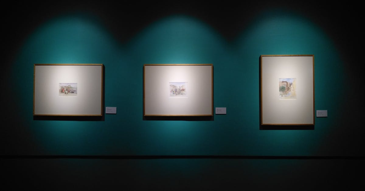
Creating intuitive signage is crucial in guiding visitors effortlessly through an exhibition space. Clear and concise information presented on signage helps individuals navigate the area with ease. By strategically placing signs at key points, visitors can quickly identify different sections and access the necessary information without confusion.
Utilizing symbols and icons alongside text can further enhance the effectiveness of signage. Visual elements transcend language barriers and provide immediate understanding to diverse groups of individuals. When designing intuitive signage, simplicity is key - avoiding clutter and irrelevant information ensures that the message is conveyed swiftly and accurately to visitors.
Engaging Visitors with Interactive Displays
Interactive displays hold the power to captivate visitors and immerse them in a sensory experience unlike traditional static exhibits. By integrating touchscreens, virtual reality headsets, or motion sensor technology, designers can offer a multi-dimensional journey that resonates with the audience on a deeper level. These interactive elements not only entertain but also educate, providing a dynamic platform for conveying information in a memorable and engaging way.
Incorporating technology into exhibition design not only enhances visitor engagement but also encourages active participation. Interactive displays can prompt individuals to explore, discover, and interact with the content, fostering a sense of curiosity and involvement. Through gamification and interactive storytelling, visitors are encouraged to play an active role in the exhibition, making their experience more personalised and meaningful.
Incorporating Technology to Encourage Participation
Incorporating technology within exhibition designs offers a dynamic way to engage visitors and encourage active participation. By integrating interactive displays, such as touchscreens or virtual reality experiences, attendees can immerse themselves in the content presented, fostering a deeper connection with the exhibition. These technological elements not only attract attention but also provide a memorable and interactive experience that enhances visitor engagement.
Furthermore, utilising technology in exhibition designs enables organisers to collect data on visitor interactions and preferences. Through tracking how visitors engage with the interactive displays or digital content, event planners can gain valuable insights into audience behaviour and interests. This data can then be used to tailor future exhibitions to better meet the needs and expectations of attendees, ultimately creating a more personalised and engaging experience for visitors.
Tailoring Visual Elements to Target Audience
When tailoring visual elements in exhibition design, it is crucial to consider the preferences and characteristics of the target audience. By understanding the demographics, interests, and expectations of the visitors, designers can create a more engaging and relevant experience. For example, if the exhibition caters to a younger audience, vibrant colours, modern typography, and interactive elements may be more effective in capturing their attention and sustaining their interest throughout the display.
Moreover, adjusting the visual elements to resonate with the specific demographic groups attending the exhibition can enhance the overall impact of the design. For instance, when targeting a diverse audience with varying cultural backgrounds, incorporating elements that are inclusive and representative of different cultures can foster a sense of belonging and connection. By customising the visual aspects to align with the audience's preferences and characteristics, designers can effectively communicate the intended message and create a more meaningful experience for visitors.
Adapting Design Choices to Appeal to Specific Demographics
Adapting design choices to appeal to specific demographics is a crucial aspect of creating a successful exhibition. By tailoring visual elements to suit the preferences, interests, and characteristics of different audience segments, designers can effectively engage visitors and enhance their overall experience. Understanding the diverse demographics that may attend the exhibition is essential for crafting a design that resonates with each group.
Demographics such as age, gender, cultural background, and interests play a significant role in shaping design choices. For example, a design targeted at a younger audience might feature vibrant colours, modern graphics, and interactive technology to capture their attention and create a dynamic atmosphere. On the other hand, a more mature demographic may appreciate a more refined and elegant aesthetic with a focus on historical context and informative content. By considering the specific characteristics of each demographic, designers can create an exhibition that speaks directly to the interests and preferences of the target audience.
FAQS
How can visual hierarchy enhance communication in exhibition design?
Visual hierarchy helps in guiding the audience's attention, prioritizing information, and creating a clear flow of communication within the exhibition space.
Why is it important to integrate navigation systems in exhibition design?
Integrating navigation systems ensures that visitors can easily navigate through the exhibition space, enhancing their overall experience and allowing for seamless exploration.
How does creating intuitive signage contribute to easy direction for visitors?
Intuitive signage helps in providing clear directions and information to visitors, making it easier for them to understand the layout of the exhibition and find their way around.
In what ways can interactive displays engage visitors effectively?
Interactive displays encourage active participation from visitors, creating an immersive and memorable experience that enhances engagement with the exhibition content.
How can technology be incorporated to encourage participation in exhibition design?
By integrating technology such as interactive screens, augmented reality, or virtual reality experiences, exhibition designers can create interactive elements that actively engage visitors and encourage participation.
Why is it important to tailor visual elements to the target audience in exhibition design?
Tailoring visual elements to the target audience helps in creating a more relevant and engaging experience that resonates with the specific demographics visiting the exhibition.
Related Links
Implementing Visual Hierarchy Techniques in Exhibition GraphicsPrinciples of Visual Hierarchy for Exhibition Graphics
Mastering Visual Hierarchy for Effective Exhibition Graphics
The Impact of Visual Hierarchy on Audience Perception in Exhibition Design
Utilizing Visual Hierarchy to Guide Viewer Engagement in Exhibition Graphics