The Psychology of Font Pairing in Exhibition Graphics
The Role of Colour Psychology in Font Pairing for Exhibitions
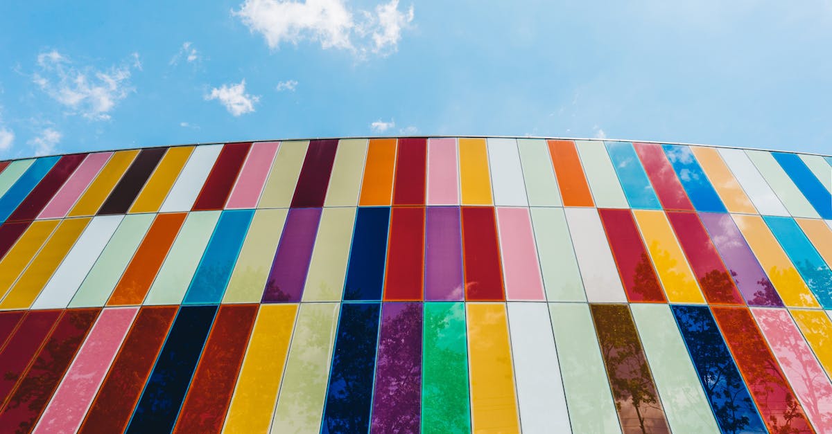
Colour psychology plays a pivotal role in the art of font pairing for exhibitions, influencing how viewers perceive and engage with the displayed content. Each colour carries its own emotional connotations and associations, which can evoke varying responses from individuals based on cultural backgrounds and personal experiences. When selecting fonts for exhibition graphics, it is crucial to consider the psychological impact of colour combinations to effectively communicate the intended message to the audience.
Certain colours are known to convey specific emotions and moods. For instance, warm hues like red and orange often elicit feelings of energy, passion, and excitement, making them suitable for graphics intended to grab attention and convey a sense of urgency. In contrast, cool tones such as blue and green are commonly associated with calmness, trust, and tranquillity, ideal for promoting a sense of professionalism and reliability in exhibition displays. By strategically pairing fonts with complementary colours, designers can create harmonious visuals that resonate with viewers on a subconscious level, enhancing the overall impact of the exhibition graphics.
Impact of Font Colour on Viewer Perception and Emotional Response
Font colour plays a crucial role in influencing viewer perception and emotional response in exhibition graphics. Different colours evoke varied emotions and reactions in individuals, making it essential to carefully consider the psychological impact when choosing font colours for displays. Bright, vibrant colours like red or yellow often convey a sense of energy, excitement, and urgency, while calmer hues such as blues and greens can create a more soothing and peaceful atmosphere. Understanding the associations that viewers may have with different colours is key to achieving the desired effect in exhibition graphics.
Moreover, the contrast between font colour and background colour can greatly influence how the text is perceived by viewers. High-contrast combinations like black text on a white background are often easiest to read and convey a sense of professionalism and clarity. On the other hand, low-contrast pairings may be more challenging to read but can create a more subtle, sophisticated aesthetic. By strategically selecting font colours that complement each other and the overall design scheme, exhibition designers can effectively guide viewer interpretation and emotional engagement with the displayed content.
Understanding Gestalt Principles in Font Pairing
Gestalt principles play a crucial role in font pairing for exhibition graphics. The principle of proximity suggests that elements placed close to each other are perceived as a group, influencing how viewers interpret the information presented. When selecting fonts for exhibition graphics, it is essential to consider the proximity of different text elements to establish visual relationships and guide the viewer's attention effectively.
Moreover, the principle of similarity highlights the importance of using fonts that share common characteristics to create a cohesive and harmonious visual experience. By selecting fonts that have similar styles or visual properties, exhibition designers can enhance the overall aesthetic appeal of the graphics and improve the readability of the content. Adhering to Gestalt principles in font pairing not only enhances the graphic design of exhibitions but also contributes to conveying information in a clear and engaging manner to the audience.
Leveraging Proximity and Alignment for Visual Hierarchy
Proximity and alignment play a crucial role in establishing a clear visual hierarchy in exhibition graphics. By strategically placing elements close to each other, designers can indicate a relationship between different pieces of information. This closeness implies connection and helps viewers navigate through the content with ease. Moreover, aligning elements creates a sense of order and structure, guiding the viewer's eye along a predetermined path.
When employing proximity in font pairing, it is essential to consider the overall layout of the exhibition graphics. Grouping related text elements together helps viewers understand the relationships between different sections or concepts. By organising information in a logical manner, designers can enhance the coherence of the graphic design and ensure that viewers can quickly grasp the intended message. Additionally, aligning text elements based on a consistent grid system can create a visually pleasing composition that facilitates a smooth reading experience.
Enhancing User Experience Through Intuitive Font Pairing
When it comes to enhancing user experience through intuitive font pairing in exhibition graphics, there are several key considerations to keep in mind. The choice of fonts plays a crucial role in how viewers interact with and perceive the information presented to them. By selecting complementary fonts that work harmoniously together, designers can create a cohesive and visually appealing design that engages and captivates the audience.
In addition to selecting the right combination of fonts, it is important to consider factors such as font size, spacing, and alignment. These elements not only impact the overall aesthetic of the design but also influence the readability and navigation for viewers. By maintaining a balance between creativity and functionality, designers can create exhibition graphics that not only look visually striking but also deliver information effectively to the audience.
Improving Readability and Navigation in Exhibition Graphics
When it comes to creating exhibition graphics, ensuring readability and navigation are crucial for a successful viewer experience. By carefully selecting font pairings that complement each other without overpowering the content, designers can significantly improve the overall readability of the information presented. Choosing fonts with varying weights and styles can help differentiate between headings, subheadings, and body text, making it easier for viewers to quickly scan and understand the key points.
In addition to font selection, designers should pay attention to the spacing and alignment of text within the exhibition graphics. Proper alignment and proximity of text elements can help create a visual hierarchy that guides viewers through the information in a logical sequence. By strategically placing text blocks and ensuring consistency in spacing, designers can enhance navigation and flow within the graphics, ultimately improving the overall user experience.
FAQS
How important is font pairing in exhibition graphics?
Font pairing plays a crucial role in exhibition graphics as it can significantly impact the overall visual appeal and effectiveness of the message being conveyed.
How does colour psychology influence font pairing for exhibitions?
Colour psychology influences font pairing by creating specific emotions and perceptions that can enhance or detract from the message. It is essential to consider how colours interact with each other and with the chosen fonts to create a harmonious design.
What role does font colour play in viewer perception and emotional response?
Font colour can evoke different emotions and influence viewer perception. For example, warm colours like red and orange may create a sense of urgency or excitement, while cool colours like blue and green can convey calmness and reliability.
How can Gestalt principles be applied to font pairing in exhibition graphics?
Gestalt principles can be applied to font pairing by focusing on concepts such as proximity, similarity, and closure. By leveraging these principles, designers can create visually cohesive and impactful designs that draw viewers in.
How does proximity and alignment contribute to visual hierarchy in font pairing?
Proximity and alignment play a crucial role in establishing visual hierarchy in font pairing. By strategically grouping and aligning text elements, designers can guide the viewer's eye and emphasise important information effectively.
How can intuitive font pairing enhance user experience in exhibition graphics?
Intuitive font pairing can enhance user experience by making the content easier to read and navigate. By selecting complementary fonts that are visually appealing and easy to digest, designers can create a seamless and engaging experience for viewers.
In what ways can font pairing improve readability and navigation in exhibition graphics?
Font pairing can improve readability and navigation by ensuring that text is clear, legible, and well-structured. By choosing fonts that are appropriate for the content and purpose of the exhibition, designers can enhance the overall coherence and accessibility of the graphics.
Related Links
Achieving Cohesive Design with Thoughtful Font PairingTips for Effective Font Pairing in Exhibition Design
Font Pairing Strategies for Engaging Exhibition Displays
Enhancing Visual Communication through Font Pairing
Exploring Font Combinations for Visual Impact