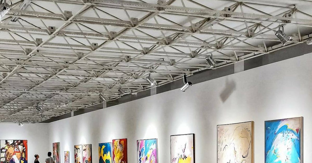
Creating Visual Impact with Colour Harmony in Exhibition Graphics
Impact of Colour on Audience Perception
Colour plays a crucial role in shaping the perception of the audience when viewing exhibition graphics. The careful selection and combination of colours can evoke specific emotions and responses in viewers, influencing how they engage with the displayed content. Whether it's a bold and vibrant palette that captures attention or a more subtle harmony that conveys a sense of elegance, the colours used in exhibition graphics have the power to leave a lasting impression on the audience.
By understanding the psychological effects of different colours, designers can strategically use them to create the desired impact on the audience. Warm colours like reds and yellows can evoke feelings of energy and excitement, while cooler tones like blues and greens may convey a sense of calm and tranquillity. Additionally, contrasting colours can create visual interest and draw attention to key elements, guiding the viewer's gaze and emphasising important information. The careful manipulation of colour in exhibition graphics can therefore enhance the overall viewer experience and effectively convey the intended message.
Influence of colour on viewer engagement
Colour plays a significant role in engaging viewers with exhibition graphics. When used effectively, colour can evoke emotional responses and capture the attention of the audience. Bold and vibrant colours have the power to energise and excite viewers, drawing them in to explore the exhibition further. On the other hand, more subtle and muted colours can create a sense of calm and sophistication, encouraging viewers to take their time and appreciate the content on display.
The choice of colour palette can influence how viewers perceive the exhibition overall. For example, warm colours like reds and oranges can create a sense of warmth and familiarity, making viewers feel more connected to the content. In contrast, cool colours such as blues and greens can evoke a sense of serenity and professionalism, shaping viewers' perceptions of the exhibition as a whole. By understanding the psychological impact of different colours, designers can strategically use colour to engage viewers and enhance their overall experience.
Balancing Vibrancy and Subtlety
When it comes to creating exhibition graphics that truly captivate your audience, finding the perfect balance between vibrancy and subtlety is key. Vibrant colours can grab attention and evoke strong emotions, while subtle hues can add sophistication and depth to your designs. Striking this balance will ensure that your graphics are visually appealing without overwhelming viewers.
One effective way to achieve this balance is by using a combination of both vibrant and subtle colours strategically throughout your exhibition graphics. By incorporating a pop of vibrant colour against a backdrop of more subdued tones, you can create a dynamic visual impact that draws the eye without being overpowering. Experimenting with different colour combinations and contrasts will help you find the right mix that best conveys your intended message and enhances the overall aesthetics of your exhibition display.
Achieving visual balance in graphic elements
When creating exhibition graphics, achieving visual balance in graphic elements is crucial to ensure that the overall design is cohesive and appealing to the audience. This involves strategically placing graphic elements such as text, images, and shapes to create a harmonious composition that captures attention without overwhelming the viewer.
One way to achieve visual balance is by considering the size, weight, and distribution of elements within the design. By varying the scale of different components and spacing them out thoughtfully, you can create a balanced layout that guides the viewer's eye smoothly across the graphics. Additionally, paying attention to the contrast between different elements can help create visual interest and ensure that each part of the design stands out effectively.
Enhancing Visual Hierarchy with Colour
Visual hierarchy plays a vital role in guiding viewers through exhibition graphics effectively. Colour is a powerful tool that can be utilised to enhance this hierarchy and direct attention where desired. By strategically using colours, designers can create a visual path for the audience to follow, leading them seamlessly from one focal point to another.
A key aspect of enhancing visual hierarchy with colour is to establish a clear contrast between different graphic elements. Contrasting colours can help to differentiate between sections, highlight important information, and create a sense of order. By carefully selecting a colour palette that complements each other and aligns with the overall theme of the exhibition, designers can create a harmonious visual experience that captivates and engages viewers.
Using colour to guide viewer attention
Colour plays a crucial role in directing the viewer's attention within exhibition graphics. By strategically using different hues, tones, and shades, designers can guide the audience's gaze towards specific focal points or key information. Bold and vibrant colours tend to capture attention immediately, making them ideal for highlighting important details or key messages. On the other hand, subtle or muted colours can help create a sense of harmony and balance within the overall design, preventing overwhelming the viewer and allowing them to navigate the graphic elements more easily.
Moreover, the strategic placement of contrasting colours can create visual hierarchy, guiding the viewer from one point of interest to another in a deliberate sequence. By pairing complementary or contrasting colours, designers can establish a clear flow of information and emphasis within the exhibition graphics. This technique not only helps to grab the viewer's attention but also ensures that they engage with the content in a structured and coherent manner.
FAQS
How important is colour harmony in exhibition graphics?
Colour harmony is essential in exhibition graphics as it can significantly impact how the audience perceives and engages with the displays.
What is the influence of colour on viewer engagement in exhibitions?
Colour plays a crucial role in viewer engagement as it can evoke emotions, create visual interest, and capture attention effectively.
How can one achieve visual balance in graphic elements through colour?
Visual balance in graphic elements can be achieved by carefully selecting a harmonious colour palette and ensuring that the colours complement each other to create a cohesive design.
Why is it important to balance vibrancy and subtlety in exhibition graphics?
Balancing vibrancy and subtlety is important to ensure that the graphics are visually appealing without overwhelming the audience and distracting from the main message of the exhibition.
How can colour be used to enhance visual hierarchy in exhibition graphics?
Colour can be used strategically to create visual hierarchy by guiding viewer attention to key elements, highlighting important information, and organising content in a clear and structured manner.
Related Links
Applying Colour Harmony Principles to Exhibition GraphicsThe Importance of Colour Harmony in Exhibition Design
Mastering Colour Harmony for Compelling Exhibition Graphic Displays
Implementing Colour Harmony Strategies for Successful Exhibition Graphics
Enhancing Communication through Colour Harmony in Exhibition Design
Achieving Balance and Unity through Colour Harmony in Exhibition Graphics