Mastering Colour Harmony for Compelling Exhibition Graphic Displays
Establishing Visual Hierarchy through Colour Contrast
Establishing visual hierarchy through colour contrast is a fundamental principle in creating compelling exhibition graphic displays. By strategically utilising contrasting colours, designers can guide viewers' eyes to specific focal points, creating a dynamic and engaging visual experience. This technique helps to differentiate between elements within a design, emphasizing important information and enhancing overall readability.
One effective way to establish visual hierarchy through colour contrast is to pair light and dark tones. Contrasting light colours against dark ones creates a strong visual impact, drawing viewers' attention to key areas of the display. This approach not only helps to create depth and dimension within the design but also aids in directing the viewer's gaze towards essential content, ensuring a clear and organised presentation.
Using Light and Dark Tones to Guide Viewer Attention
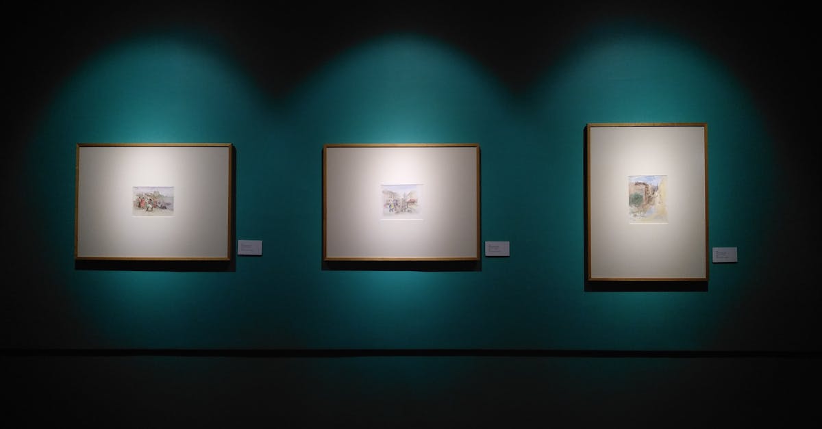
Light and dark tones play a crucial role in directing the viewer's focus within exhibition graphic displays. By strategically incorporating lighter shades in certain areas and darker hues in others, designers can guide the viewer's attention to key elements of the display. Light tones tend to draw the eye first, making them ideal for highlighting important information or focal points within the exhibit. On the other hand, dark tones can create depth and contrast, helping to emphasize specific details or provide a backdrop for lighter elements to stand out against.
When using light and dark tones to guide viewer attention, it is essential to consider the overall balance within the display. Contrast between light and dark areas can create visual interest and help important information pop, but excessive contrast can also overwhelm the viewer and detract from the overall message. Designers should aim for a harmonious blend of light and dark tones that enhance the overall impact of the exhibition graphics while maintaining a cohesive and visually appealing composition. By carefully balancing the distribution of light and dark elements, designers can effectively lead the viewer's gaze through the display and create a compelling visual experience.
Incorporating Colour Trends in Exhibition Graphics
Incorporating colour trends in exhibition graphics plays a crucial role in attracting and engaging viewers. By staying up-to-date with the latest colour palettes and combinations, exhibition designers can create visually appealing displays that resonate with the audience. Incorporating popular colour trends can evoke specific emotions and create a modern and fresh look for the overall exhibition design.
Pantone and Colour of the Year palettes are often the go-to references for designers looking to incorporate trendy colours in their exhibition graphics. These palettes are carefully curated each year to reflect current societal trends and influences. By using these established colour schemes, designers can ensure that their exhibition graphics remain relevant and visually impactful.
Implementing Pantone and Colour of the Year Palettes
Pantone and Colour of the Year palettes play a pivotal role in setting the tone for exhibition graphic displays. These palettes are carefully curated by colour experts to reflect current trends and evoke specific emotions within viewers. By incorporating these influential colour schemes into your design, you can instantly create a modern and visually appealing exhibition graphic that captivates your audience.
Colour of the Year palettes, in particular, offer a fresh perspective to graphic design by introducing innovative and inspiring shades that resonate with contemporary aesthetics. Embracing these trending colours not only showcases your design prowess but also demonstrates your awareness of current cultural influences. Whether you choose to adopt the serene hues of a Pantone Colour of the Year or experiment with bold and vibrant tones, integrating these palettes into your exhibition graphics can elevate the overall visual impact and make your displays stand out among the crowd.
Maintaining Brand Consistency in Colour Usage
Maintaining brand consistency in colour usage is crucial for creating a cohesive and recognisable visual identity across various platforms. When it comes to exhibition graphics, it's imperative to adhere to the brand's colour palette to evoke familiarity and strengthen brand recall. Consistency in colour usage helps in reinforcing brand messaging and ensuring that the audience can easily associate the graphics with the brand.
Brands can establish a strong visual presence by incorporating their signature colours in exhibition displays. By using the same colours consistently, brands can create a sense of unity and coherence throughout their graphic materials. This approach not only enhances brand recognition but also communicates a sense of professionalism and reliability to the audience.
Ensuring Cohesion with Corporate Colour Guidelines
Corporate colour guidelines play a pivotal role in ensuring a consistent and cohesive brand identity across various platforms, including exhibition graphics. These guidelines provide a framework for selecting colours that accurately represent the brand's values, positioning, and personality. By adhering to these specified colours, companies can enhance brand recognition and establish a strong visual presence that resonates with their target audience.
Consistency in colour usage is vital for reinforcing brand recall and fostering brand loyalty. When designing exhibition graphics, it is crucial to align the chosen colour palette with the colours stipulated in the corporate guidelines. This harmonious integration of colours not only strengthens the brand's visual identity but also conveys a sense of professionalism and reliability to viewers. Adhering to these guidelines instills trust and familiarity, ultimately contributing to a successful and impactful exhibition display.
FAQS
What is the importance of establishing visual hierarchy through colour contrast in exhibition graphic displays?
Establishing visual hierarchy through colour contrast helps guide the viewer's eye and focus on key elements, creating a more engaging and compelling display.
How can light and dark tones be used to guide viewer attention in exhibition graphics?
Light and dark tones can be strategically used to create contrast, highlight important information, and direct the viewer's gaze towards specific areas of the display.
Why is it beneficial to incorporate colour trends in exhibition graphics?
Incorporating colour trends in exhibition graphics helps keep the design fresh, modern, and visually appealing to the audience, making the display more captivating and relevant.
What are the advantages of implementing Pantone and Colour of the Year palettes in exhibition graphic displays?
Implementing Pantone and Colour of the Year palettes adds a trendy and contemporary touch to the graphics, keeping them in line with current design aesthetics and creating a visually striking presentation.
How can maintaining brand consistency in colour usage enhance exhibition graphic displays?
Maintaining brand consistency in colour usage helps reinforce brand identity, increase brand recognition, and create a cohesive visual experience for the audience, establishing a strong connection with the brand.
Related Links
Implementing Colour Harmony Strategies for Successful Exhibition GraphicsUnderstanding Colour Harmony in Exhibition Graphics
Enhancing Communication through Colour Harmony in Exhibition Design
Achieving Balance and Unity through Colour Harmony in Exhibition Graphics
Utilizing Colour Harmony for Effective Exhibition Graphic Design