Achieving Balance and Unity through Colour Harmony in Exhibition Graphics
Guiding Viewer Attention
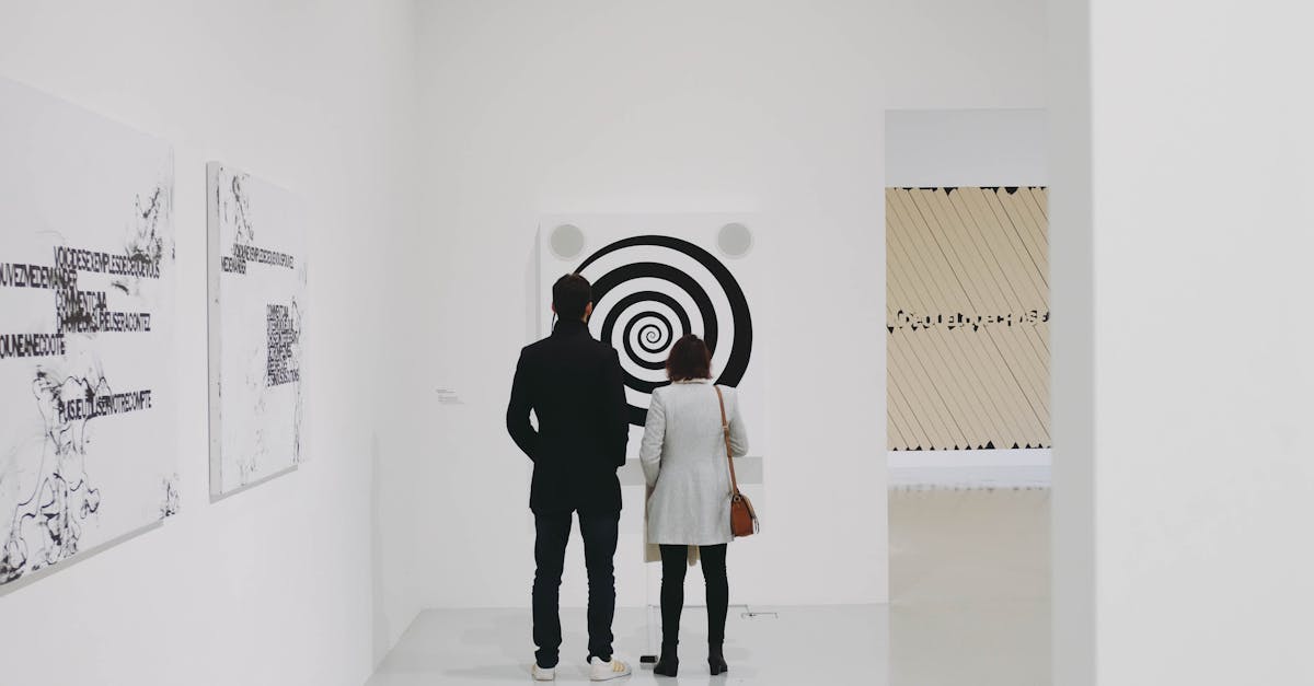
In exhibition graphics, guiding viewer attention is paramount to effectively communicate the intended message. Through strategic use of colour, designers can direct the viewer's gaze towards key elements and create a visual hierarchy that guides the eye through the display. By carefully selecting colours that stand out against the background or surrounding elements, designers can draw attention to important information or focal points within the exhibit.
Colour plays a significant role in creating contrast and emphasis in exhibition graphics. By juxtaposing complementary or contrasting hues, designers can enhance the visibility of certain areas in the display and make them more visually appealing. This not only helps to capture the viewer's attention but also ensures that crucial information or items are not overlooked in the exhibition space.
Employing Colour Contrast Techniques
Colour contrast techniques play a vital role in the design of exhibition graphics, influencing how viewers perceive and interact with the visuals. By strategically selecting contrasting colours, designers can create visual interest and ensure important elements stand out. This contrast can be achieved through variations in hue, saturation, or brightness, allowing specific elements to catch the viewer's eye and guide their attention effectively.
Contrasting colours can also help establish hierarchy within the exhibition graphics, making it easier for viewers to navigate the information presented. By pairing complementary colours or using colours from opposite ends of the colour wheel, designers can create a dynamic interplay that enhances readability and visual appeal. Additionally, colour contrast can evoke different emotions and responses in viewers, further enhancing the overall impact of the exhibition graphics.
Encouraging Engagement
Exhibitions serve as a platform for engagement, presenting an opportunity for viewers to immerse themselves in the visual narrative. By strategically utilising colour harmony in exhibition graphics, designers can enhance the overall visitor experience and encourage deeper engagement. The seamless integration of colour schemes can evoke a sense of coherence and unity, captivate attention, and guide viewers through the exhibition space with a deliberate flow of visual elements.
Colour plays a pivotal role in capturing the interest of visitors and retaining their attention throughout the exhibition. When employed thoughtfully, colour harmony can create a cohesive visual identity that resonates with the theme of the exhibition, establishing a connection between the content and the viewer. By harmonising colours in exhibition graphics, designers can craft a harmonious environment that stimulates curiosity, sparks interest, and cultivates a memorable experience for attendees.
Highlighting CalltoAction Elements
Highlighting call-to-action elements within exhibition graphics plays a crucial role in driving viewer engagement and encouraging desired responses. By strategically incorporating contrasting colours and bold typography, designers can effectively draw attention to important information such as event details, contact information, or interactive elements. The use of vibrant colours for call-to-action buttons or key phrases can create a sense of urgency and prompt viewers to take immediate action.
Additionally, the placement of call-to-action elements within the visual hierarchy of exhibition graphics is vital in guiding viewers towards their intended actions. Whether it be a clickable link, a QR code, or a social media handle, these elements should be positioned prominently and seamlessly integrated within the overall design. By ensuring that call-to-action elements stand out while maintaining visual harmony within the colour palette, designers can successfully motivate viewers to engage with the exhibition content and participate in the desired responses.
Eliciting Desired Responses
Desired responses from the audience can be skillfully elicited through the strategic use of colour in exhibition graphics. By carefully selecting hues that resonate with the emotions or actions you wish to provoke, designers can guide viewers towards specific reactions. For example, warm tones like red and orange can incite feelings of excitement and passion, while cool tones such as blue and green may promote a sense of calm and tranquillity.
Additionally, the saturation and brightness of colours play a crucial role in evoking different responses from the audience. Vibrant, high-saturation colours tend to grab attention and create a sense of energy, making them ideal for highlighting key messages or focal points within the graphic display. On the other hand, muted or pastel shades can evoke a more subtle and sophisticated response, encouraging viewers to engage with the content in a more contemplative way.
Triggering Emotional Responses through Colour
Colour plays a crucial role in evoking emotional responses from viewers when used strategically in exhibition graphics. Different hues have the power to elicit various feelings and moods, influencing how individuals interpret and engage with the displayed content. Warm colours such as reds, oranges, and yellows are often associated with energy, passion, and warmth, making them suitable for stimulating excitement and enthusiasm in spectators. In contrast, cool tones like blues, greens, and purples tend to convey a sense of calmness, serenity, and trust, ideal for creating a peaceful and tranquil atmosphere within the exhibition space.
Moreover, the saturation and brightness of colours can also impact emotional responses. Bold, vibrant shades typically evoke a sense of vitality and dynamism, encouraging a lively and energetic reaction from viewers. On the other hand, muted or pastel colours convey a more subtle and understated emotional tone, often associated with tranquillity, nostalgia, or sophistication. By understanding the psychological effects of different colours and their nuances, exhibition designers can effectively trigger specific emotions in their audience, enhancing the overall impact and success of the graphic display.
FAQS
How important is colour harmony in exhibition graphics?
Colour harmony plays a crucial role in creating a visually appealing and cohesive design that attracts and engages viewers effectively.
What are some techniques for achieving colour harmony in exhibition graphics?
Techniques such as employing colour contrast, balancing hues, and using complementary colours can help in achieving a harmonious colour scheme in exhibition graphics.
How can colour harmony help in guiding viewer attention?
By strategically using colour harmonies, designers can guide the viewer's attention towards key elements or focal points within the exhibition graphics, enhancing the overall visual impact.
Why is it essential to highlight call-to-action elements in exhibition graphics?
Highlighting call-to-action elements through contrasting colours or strategic placement can help in drawing the viewer's attention and prompting them to take desired actions, such as making a purchase or signing up for a service.
How can colour harmony be used to trigger emotional responses in viewers?
Colour harmony can evoke specific emotions in viewers based on the chosen colour palette. By understanding colour psychology, designers can use harmonious colours to elicit desired emotional responses from the audience.
Related Links
Enhancing Communication through Colour Harmony in Exhibition DesignUtilizing Colour Harmony for Effective Exhibition Graphic Design
Mastering Colour Harmony for Compelling Exhibition Graphic Displays
Implementing Colour Harmony Strategies for Successful Exhibition Graphics
Exploring Colour Harmony Techniques for Exhibition Graphics