Understanding the Role of Contrast in Colour Theory for Exhibition Graphics
Using Contrast to Guide Viewer Attention
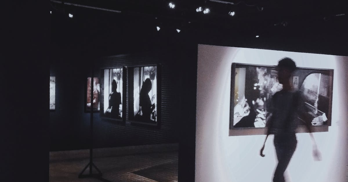
Contrast plays a pivotal role in guiding viewer attention when it comes to exhibition graphics. By strategically combining colours with varying degrees of contrast, designers can lead the viewer's eye towards specific focal points within the design. This can create a dynamic and engaging visual experience that draws the viewer in and encourages them to explore the exhibit further.
When using contrast to guide viewer attention, it is important to consider the hierarchy of information within the design. By adjusting the contrast between elements such as text, graphics, and backgrounds, designers can emphasise key messages or important visuals. This deliberate use of contrast helps to create a clear visual path for the viewer to follow, ultimately enhancing the overall effectiveness of the exhibition graphics.
Directing Focus within Designs
Directing focus within designs is a crucial aspect of creating engaging and visually appealing exhibition graphics. By strategically using contrast in colours, shapes, or sizes, designers can lead viewers' eyes to specific elements within the composition. Bold contrasts between light and dark colours, for instance, can draw attention to key information or focal points within the graphic.
Furthermore, designers can utilise contrast to highlight important details or create a hierarchy of information within their designs. By varying contrast levels between different elements, such as background and foreground elements, designers can guide viewers through the visual content in a deliberate and purposeful way. This not only improves the overall visual flow of the design but also ensures that viewers interact with the graphic in a structured and meaningful manner.
Balancing Contrast for a Harmonious Composition
To create a harmonious composition in exhibition graphics, it is essential to strike a balance in the use of contrast. While contrast adds visual interest and helps elements stand out, too much contrast can create visual chaos and overwhelm the viewer. Therefore, it is crucial to carefully consider the level of contrast used in the design to ensure a cohesive and balanced outcome.
One effective way to achieve balance is by playing with different levels of contrast within the design. This can involve combining high contrast elements with more subtle contrasts to create a dynamic yet harmonious composition. By strategically placing areas of high and low contrast, designers can guide the viewer's eye through the design while maintaining overall visual balance and coherence.
Achieving Visual Cohesion
To achieve visual cohesion in exhibition graphics, it is essential to maintain a harmonious balance of contrast throughout the design. Consistency in the application of contrast helps create a sense of unity and coherence, guiding the viewer's eyes seamlessly across the artwork. When colours, shapes, and textures work together in a harmonised manner, the overall visual impact is strengthened, making the message or theme of the exhibition more impactful and memorable.
An effective way to ensure visual cohesion is to establish a hierarchy within the design elements. By strategically varying the levels of contrast, such as using high contrast for focal points and lower contrast for supporting elements, designers can create a clear visual path for the viewer to follow. This intentional manipulation of contrast not only enhances the overall aesthetic appeal of the exhibition graphics but also helps in conveying information in a structured and engaging manner.
Contrast in Typography for Effective Communication
When considering typography for effective communication in exhibition graphics, the strategic use of contrast plays a crucial role. The choice of font style, size, weight, and colour can significantly impact how a message is perceived by viewers. By implementing contrast in typography, designers can emphasize key information, create visual hierarchy, and enhance readability.
Incorporating contrast in typography can help to guide viewers through the design, directing their attention to important details and ensuring the message is effectively communicated. Utilising differing font sizes or weights for header and body text can help to distinguish between different levels of information, making it easier for the audience to navigate the content. Additionally, incorporating contrast in typography can add visual interest to the overall design, making the exhibition graphics more engaging and memorable for viewers.
Importance of Readability
Readability is a crucial aspect of effective typography in exhibition graphics. The ability of viewers to easily decipher and comprehend the information presented is essential for the success of any design. When text is difficult to read due to poor contrast, font choice, or layout, the message can be lost on the audience, leading to a lack of engagement and impact.
Incorporating adequate contrast between the text and background is key to enhancing readability. By ensuring a sufficient distinction between the two, the text becomes more prominent and legible. Additionally, selecting appropriate font sizes and styles, as well as considering line spacing and alignment, can significantly improve the overall readability of the content. By prioritising readability in typography, designers can effectively communicate their message to viewers and create a more engaging and accessible exhibition experience.
FAQS
How can contrast be used to guide viewer attention in exhibition graphics?
Contrast can be used by incorporating differences in colour, size, shape, or texture to draw attention to specific elements within the design.
Why is balancing contrast important for achieving a harmonious composition in exhibition graphics?
Balancing contrast ensures that the different elements in the design work together cohesively, creating a visually pleasing and well-structured composition.
How does contrast in typography contribute to effective communication in exhibition graphics?
Contrast in typography, such as variations in font size, weight, and style, helps to emphasize key information, improve readability, and guide the viewer's focus on important content.
What is the significance of achieving visual cohesion when using contrast in colour theory for exhibition graphics?
Achieving visual cohesion through the use of contrast ensures that all elements in the design visually complement each other, creating a unified and impactful visual experience for the viewer.
How can designers effectively direct focus within their designs using contrast in colour theory?
Designers can direct focus by strategically applying contrast to highlight focal points, create hierarchy, and lead the viewer's eye through the design in a deliberate and engaging manner.
Related Links
Utilizing Colour Contrast to Enhance Exhibition GraphicsThe Importance of Colour Contrast in Exhibition Graphics
Optimising Colour Contrast for Maximum Impact in Exhibition Graphics
Enhancing Visual Hierarchy through Colour Contrast in Exhibition Graphics
Effective Application of Colour Contrast in Exhibition Graphics